What's it all about?

This blog is about photography and photoediting. Its purpose is to provide hints and tips and links to interesting and useful resources for digital photographers, regardless of their level of expertise or experience. It is aimed at people who use digital SLR cameras and who process their images using the latest versions of Adobe Photoshop and Adobe Photoshop Lightroom.

The author of this blog is Glenn Springer and you can read more about him at his web portal at faczen.com. Information on workshops, and links to everything is at photography.to. Glenn's original blog, which is an ongoing journal of his photographic meanderings goes back to 2006 and contains many additional hints and tips, as well as representative images that he has made. Gallery quality prints are available through his Smugmug gallery site. It is an interesting place to visit to see a variety of quality images, as well as an ongoing general journal of photos going back several years.

Photography workshops are scheduled every few weeks starting in the Spring. For an overview of what's happening, please visit the photography.to website.

The most recent blog post is below. Scroll down to the bottom to see the list of previous postings or search for any particular topic.


Showing posts with label Lightroom. Show all posts

Tuesday, April 7, 2015

Exporting Images from Lightroom

Why is the concept  of sizing or setting the aspect ratio of images for print so difficult for some people to grasp? I don't get it. So here's an attempt to address the issue in a way that might help people understand it better.

Pixels-per-inch or Dots-per-inch

This comes up OVER and OVER and OVER again and people do not understand it.

The pixels-per-inch (ppi) box is only useful to people who specify their image sizes in INCHES and not in pixels. If you tell Lightroom (or Photoshop or any other program) that you want a picture to be 10 inches wide and 300 ppi, that means you are telling it to give you a 3000 pixel wide image. If you want  you can do that, but you could also tell it you want to print a 100 inch wide image at 30 ppi and you'll get EXACTLY THE SAME IMAGE. Or you could just tell it to give you a 3000 pixel wide image and it doesn't matter what you put in the ppi box! Here:


One of these images is 819 pixels x 1024 pixels at 1 (yes, that's ONE) ppi. The other one is 819 pixels x 1024 pixels at 1,000 ppi. Can you tell which is which? No you can't. THEY'RE THE SAME. Keep reading...

Added after the fact: This post is getting a LOT of hits because this question seems to come up a lot on Facebook. Both the Aspect Ratio and the Print Resolution questions. If you find this useful, please consider clicking the donation request at the bottom – purely optional but it would help! At least, I would ask you to subscribe to my newsletter (it's free and you can unsubscribe with one click if you must). Here's the link  

Now let's look at the ASPECT RATIO, or in plain English, the SHAPE of the picture.

Suppose this is the original picture:


This image is copyrighted and the property of the author. If you want to use it for any purpose whatsoever, you need written permission. Email me. If you want a print, I'd be happy to accommodate you at a very reasonable price. Please don't rip it off.

It's ASPECT RATIO (that's the technical term: maybe it's easier to understand the word "SHAPE") is 2:3. What does that mean?

For every 2 units high, it is 3 units wide. When it came out of the camera it was 4912 pixels high x 7360 pixels wide. That's out of a D800 so it's 36 million pixels if you multiply it out. If it came out of an old D70 it would be 2000 x 3008 pixels: only 6 Megapixels, but exactly the same shape — 2:3*.
* for all intents and purposes. I know neither one is EXACTLY 2:3 but we're splitting hairs here.
A Canon 60D has a resolution of 3456 x 5184 pixels. Do the math: guess what the shape of the image is? That's right, 2:3. Pretty standard in the DSLR world. Your camera might be different but let's go with this example.

OK, what if you wanted to print this picture without cutting ("cropping") anything off the height or the width of the image? What shape would the paper you're printing on have to be?

If you said 2:3 then you're staying with me! Can you think of some examples of paper that is that ratio? Look at this list:

  • 4" x 6" (10 cm x 15 cm)
  • 5" x 7" (12.5 cm x 17.5 cm)
  • 8" x 10" (20 cm x 25 cm)
  • 8" x 12" (and so on...)
  • 11" x 14" 
  • 12" x 12"
  • 16" x 20"
  • 16" x 24"
  • 20" x 30"

Which ones are the right shape? Do the math, I'll wait right here...

If you said the 4x6, the 8x12, the 16x24 and the 20x30, now you're cooking!

So what happens if you try to print that picture on an square piece of paper, say 12"x12", for example. One of three things:

  1. the image can completely fill the paper, but some of the width will get cut off. In other words, you're printing the full 12" height, but there's only room for 12" of width so the other six inches are going to get cut off (remember your picture is 2:3 shape, so if it's 12" high it's going to be 18" wide).


  2. you can squeeze the 18" width of the picture into the 12" width of the paper, but then you'd be squeezing the height too, so the height will only be 8" high and there'll be a 2" band of unprinted paper above and below the picture, or


  3. you can squeeze the width of the picture without changing the height, but this distorts your picture (you'd have to get fancy in Photoshop to do this, though)


Get it? So it's your choice how you want the image to be printed (nobody ever uses the third choice), with some stuff getting cut off or with some unprinted paper. Make sense?

So what should you do to make the picture fit the paper? It's up to you, of course. Chances are it isn't going to get cropped the way you like it by the printer, so you should decide in advance and change the shape of the picture to match the shape of the paper. That's called "CROPPING" and you do that in Lightroom in the Develop module. 


The red arrow shows you where to click to get the crop tool. The blue arrow shows where to click to get the dropdown menu that you see with the different shapes 

So do the math – it's basic grade 4 arithmetic – and figure out what aspect ratio you want. If you don't see it there, you can click "Enter Custom" and put in your own numbers, so if you want your own special size, that's where you can do it.**
** This isn't limited to printing, you know. For example, the shape of the header at the top of this blog is 1280 x 350 pixels. If you look closely at the list, you'll see "3.657 x 1" which is that shape. You don't actually have to do the math, you could just enter 1280 x 350 and Lightroom will do it for you!
Added Later:
A good workflow practice in Lightroom would be to create a  "Virtual Copy" of the image if you're going to produce different crop shapes. Then work your magic on that copy without affecting your original. You can't rename the virtual copy without renaming the original but you can put something in the "Copy Name" field in the metadata, like "square version" so that you can search for it later. 
Summary:

So now you should understand why, when you try to print your 2:3 ratio picture on a piece of 5x7 paper, some of it is getting cut off. The only way to prevent that is to print it like the second example above. Or you can decide to cut it off wherever YOU want by cropping in Lightroom. So far so good?

Now let's look at RESOLUTION.

You're probably looking at this article on a computer screen (OK, maybe on a tablet or phone, but let's go with the easy example!)

When you set up your computer, you chose the screen resolution (or, let's face it, you accepted whatever you got when it came home from the store). Depending on what kind or shape of monitor you have, you might have selected 640x480 pixels (if you did, you're older than me. And trust me, I'm OLD!). Or 1600x900. Or 1280x1024. Or some other number. My 26" Samsung monitor is set for 1920x1050 pixels.

Now just to confuse you further, my "26-inch" monitor is really only 23½" wide. The 26" is a diagonal measurement. But let's divide that 1920 pixels into 23½", we get about 81 pixels per inch. The universal standard for computer monitors and the Internet is 72 pixels per inch but who's counting? Close enough.
You could quibble with me and tell me you have a fancy 'Retina' display or a giant monitor, or a $500 video card that lets you see 4000 pixels on your screen but hey...
Now go to the top of this article and read what I said about the resolution of the owl picture as it came out of my camera. Wow. 7360x4912 pixels! If I tried to look at every pixel of that on my computer, it would be dripping out of my monitor and down both sides of my tabletop! So guess what? I CAN'T look at them all. I can only squeeze them into the 1920 pixels (wide) that are available to me.

OK, now go find a magnifying glass. I'll wait right here. Are you back? Now look really closely at your computer screen. See how it looks like a bunch of little square dots? Those are called pixels.

So if I want to output a picture for use online or just to be viewed on a computer or tablet, I don't need it to be any bigger than about 2000 pixels (wide). Otherwise it's a waste anyway, you can't see the in-between ones. Since you probably aren't looking at any pictures at the full width of your monitor, even that big is a waste. Make them smaller!
Facebook is special. They have some nasty compression algorithms that mess up pictures. If you research it, you'll find that the best size to make a picture, to optimize how it looks on Facebook, is 2048 pixels. Don't even think of asking why.
Your computer is smart. You don't have to tell it how many pixels per inch to make the picture, that's determined by the computer and the monitor. Even if you tell it you want 10,000 pixels per inch it can't do it! It's going to change it to 72 ppi (Pixels per inch) for you. The important thing for you to decide is how many pixels (wide, for example) you want the image to be. Half a screen width is about 800 pixels. What about if you only output your picture at 200 pixels wide, and then tried to blow it up to full-screen (your browser can do it, for instance)? Then it's going to look all unsharp and fuzzy because there's not enough information to exactly light up all of the pixels. Get it?

So if you're outputting a picture for the internet, somewhere between 800 and 2000 pixels is best. Of course the bigger you make it, the bigger the image file size becomes, the slower it is to load, etc. Your call...

I choose to make my pictures 1280 pixels wide for this blog. Here's what my settings look like in the Lightroom export module:


The internet, and your computer monitor, all work in the sRGB colour space. If you set it to something else, your colours are going to look funny. And generally you're going to want JPEG image files, the internet likes them the best. 

Understand that your files inside Lightroom are probably not going to be that size. For that matter, they won't necessarily be JPEG's, they may not be in that colour space... they're your NEGATIVES. You need to EXPORT the pictures from Lightroom to use them for anything, and this is where you get to tell it what kind of files, what size, etc.

Now what about for printing?

Go get your magnifying glass and a photographic print. Do you see a bunch of little pixels? (If you do, you're not looking at a photo print, you're looking at something reproduced on a printing press, not an inkjet or giclée printer). Your printer has a bunch of little nozzles that spray ink on the paper but in a really teeny-tiny pattern. Some of the better ones might spray up to 1400 ink dots per inch! (DPI stands for "DOTS per inch". PPI is "PIXELS per inch". One's for ink, the other for screens).

I'm not going to get into how the ink spreads as it soaks into the paper, or how it blends together with nearby dots. Suffice it to say: the universal standard for not being able to see the little individual dots is 300 DPI. Some people use 240 DPI, some use 360... but let's call it 300 to be safe. If you have less information than that the in-between dots are going to take on an average value, not the right value, so your picture will get fuzzy.


Here's the same owl shot but I saved it at only 128 pixels wide then blew it up. The same thing happens if you don't have enough pixels to print! And you need a lot more for printing than you do for displaying on-screen! 

Doing the arithmetic, if you want a sharp 8x10 print, you are going to need 300x8 dots by 300x10 dots, or 2400x3000 pixels. For a 16x20, double that. For a 20x30, you need 6000x9000 dots. That's more than most cameras can do but Adobe, who makes Lightroom and Photoshop, and a bunch of other companies know how to intelligently upsize your pictures. The person who REALLY knows how is the company that you're sending your images to print! Always ask them what they want when your image is undersized.

Where were we... by now, you understand that the really important number is how many pixels (or dots) your picture contains. Just like your monitor, that printer will change the number of dots per inch to whatever it has available. If you give it only 1500 dots and you ask for a 10" print, you're only going to get 150 dots per inch (which surprisingly, isn't bad most of the time!).

If you give them too many pixels, don't worry! The printer is smart (not necessarily the person pushing the buttons, the machine!) and it will figure out what to do with the in-between ones, just like your monitor does if you give it an oversized picture. The files might be too big, though!

Why does Lightroom have that dreaded resolution box I marked with an "X" above? It's for people who would prefer to output pictures of a certain size in inches (or cm) and then you have to tell it how many pixels per inch to render. If you do the math yourself, and specify the image size in pixels, that box doesn't matter.


Here's one of my typical settings for going to print (it does 14" on the long side at 300ppi). Note that most printers like JPEG/sRGB as well, but talk to your print shop!

So get in the habit of figuring out how many pixels or dots you want. Let the computer do the rest. Or, choose the size of the picture you want in inches (or cm) and tell it 72 ppi for screen or 300 ppi for printing.


BIG SUMMARY.

In Lightroom, first choose what SHAPE you want the image to be using the crop tool in the Develop module. Next choose what SIZE it should be in pixels wide x pixels high, using 72 ppi for use on screen or 300 ppi for use in print in order to make your calculations.

If you're going to be printing different sizes and shapes, it's probably smart to create separate output files for each version and virtual copy is one way of doing that and staying organized.

Make sense?

Check out my weekly blog, The Faczen Image! Click the "Newsletter" button if you want to be kept up to date. Try it. I dare you.


— 30 —


Wednesday, March 4, 2015

Lightroom Performance and Previews

This article was written in response to a request from the Admins on the Facebook "Lightroom Q&A" group. 

If you appreciate the effort, please have a look at my main weekly blog which contains my "sporadic musings and compelling images" as well as photography and post-processing tips and techniques. All designed to give you ideas! By hitting the "Newsletter" button at upper right on the blog, you'll get an email note when a new post appears, as well as free access to my eBooks and other resources.


Note: I use Lightroom 5 (version 5.7 at this writing) and Photoshop CC 2014. Some of these functions also work in earlier versions of the programs. I run on a PC, not a Mac but they're almost the same in Lightroom.

Lightroom sometimes appears to respond and process images slowly. Some of that is due to your preview settings, which you can change to match your needs and available hardware.

Right after importing new images, people sometimes complain that when Lightroom opens a RAW file, first it looks sharp, then it looks ugly for a while, then it gets sharp again, especially when viewing the image larger than grid view. What's happening?

That exact sequence really only happens on newly imported files, where Lightroom hasn't yet had time to generate the standard previews. First thing you see is the JPEG view that is embedded into the RAW file by your camera. That gives way to the unprocessed RAW file while Lightroom churns away in the background to generate the 1:1 preview. Finally you'll see the image in all its glory, including edits you've made inside Lightroom.

You may also see a delay in seeing this full quality image when you view an image in a larger view (like Loupe, or in the Develop module, or especially when you zoom in to a 100% view). Again, Lightroom needs the 1:1 preview and may ask you to wait while it's being generated.

Importing new images

In the process of importing new images, Lightroom's overall performance might appear to be slow because it's working in the background, using computer resources. One of those things is generating the full 1:1 preview you use whenever you zoom in on an image. You can improve that performance by delaying when that happens (you can do that at any time from Library → Previews in the main top menu). Here's what the upper right corner of your LR screen looks like just before you tell it to start importing:


You have four options here. These are the settings I use. I always make a second copy of all images to a different hard drive – in this case the internal drive in the computer (the originals are stored on an external drive). I want Smart Previews for all my images so I can edit them when that external drive that contains the actual images is not plugged into the computer. I don't tell it to block suspected duplicates because in my workflow, I format all my camera memory cards after the pictures are safely imported: if I forget, that's my problem!


I tell Lightroom to build 1:1 previews for all images during the import process. If I wanted to make importing faster, I would select "Minimal" previews or one of the lesser sizes. But I don't shoot NFL football games where I only have minutes to process and cull thousands of images during halftime. When I do an import, I generally plug the card into the computer, start it going, then pour myself a cup of coffee (or something stronger!) and give it time to get it done. 

Hard Drive Space

Now let's look at what those 1:1 preview files look like.

Previews take up some hard drive space. But not that much, in the grand scheme of things! Remember that Lightroom is just a glorified database: it does NOT contain your actual images, just pointers to tell it where to look for them, just like that card file in the old public library tells you which shelf to look for when seeking a specific book.


This Lightroom Catalog is my main one. It contains 63,423 images as I write this, many of which are 40 Mp giant RAW files from my D800 (not that it matters what size the images are to the catalog!). If you ever want to know WHERE your LR catalog is, you can bring this dialog up by clicking "Catalog Settings" on the "Edit" menu in the Nav bar at top left (may be a bit different on a Mac). So I have almost 3 Tb of images (3000 Gb) all listed in a 2.47 Gb ".lrcat" file in my internal hard drive.

I don't want to stray too far off-topic here but this is a screenshot of my catalog folder on the hard drive. The Lightroom catalog itself is 2.5 Gb. When you're backing it up (or copying it elsewhere) THAT is the file you need to copy. The two .lrdata preview files are not important to back up, Lightroom will regenerate those. The Catalog Preview file is relatively big: 13 Gb in this case. 

Now my Catalog Previews file is ONLY 13 Gb because I've chosen to manage its size. If I had full 1:1 previews from all 63,000 images it would be much bigger. Here's where you manage that.


In the same place as before (Edit → Catalog Settings), open the "File Handling" tab. You have three choices you can make about your previews. 

The first line is about the SIZE of the preview.


My biggest monitor is set to 1920x1080 pixels. I chose a preview size so I could see ALL of those pixels, so just larger than the screen. If you have a lower resolution monitor, you don't need the preview to be that big.  

You can also choose the preview quality. I find "Medium" to be good enough for me. Remember, you're not changing the image, just how you view it onscreen when you zoom in to edit. When I do a really fine edit, I switch to Photoshop.

Now here's the big space saver. You get to decide how long the huge 1:1 previews stay on your computer.


In my case, I decided I don't need the 1:1 previews instantly available on images I'm not currently working on. So I tell Lightroom to discard them after one week.  

Performance

When you click on an image in Loupe view or Full Screen, or in the Develop or Print or Slideshow or Web module, and especially when you zoom in, Lightroom needs that 1:1 preview. So it takes some time to generate it if you have discarded it. Once it has, it'll keep it around as long as you've told it to in the above menu.

Adobe has a resource page if you want to read more on this subject. It's here: https://helpx.adobe.com/lightroom/kb/optimize-performance-lightroom.html

To summarize: 

If you have tons of hard drive space, go ahead and keep your 1:1 previews forever. If you have limited RAM or CPU speed, you may want to hold off generating them immediately on import. Lightroom can churn away in the background if you tell it to (Library → Previews from the main top menu) or when you decide to look closely at an image. It all depends on your hardware resources and your workflow requirements.

Does that make sense?


Please take a moment to visit my weekly blog. I dare you.


— 30 —

Saturday, May 10, 2014

Workflow Tips

I thought I'd share a couple of workflow tips for my photographer friends.

I don't have to do high speed editing like a sports photographer might. I generally don't import thousands of images at a time, but I might do a couple of hundred. This is just a quick overview of my process and I've highlighted a few of the things I think about. This is not a detailed explanation, it takes too long to write that and I don't want to put anyone to sleep. Just some things to think about.

1. Import
I put the memory card in the reader and I have the computer set up to automatically open Lightroom. The import dialog appears, and I've written a preset called "D800 import" that automatically sets up some parameters: where the images are saved, where the second copy (backup) is saved (on a different drive), it adds my copyright info in the metadata, and some really basic settings like sharpening, clarity, vibrance, camera profile, lens correction, etc. I can always change those but most RAW files need something to make them look ok on import. Click "Go" and depending how many images, get a coffee.

2. Flag Status
The D800 gives you huge files. I don't necessarily want to keep them all and some of them are certainly worth prioritizing for the next step in the editing cycle. I blow them up to full size on the big monitor and go through the whole batch, hitting "X" for reject, "P" for pick or just skipping them if I'm not sure. Pictures I want to work on first, I'll hit "6" (puts an "Edit Now" flag on them) and really good ones I'll mark with a 3- or 4- or very rarely a 5-star rating.  I also use "7" on series' of bracketed pictures I will want to merge to HDR.

Next step is the hard-hearted click on ctrl-backspace to permanently delete all the rejected photos from disk. These are pictures you're NEVER EVER going to want to see again.

This whole thing is really a quick process, assuming I've taken that few minutes to let Lightroom generate the  previews before I start. 200 images, maybe 10 minutes.

3. Keywording
This is a good time to do it. These are all potential keepers, and if you ever want to find them again... you can do them quickly in batches and add more later.

4. Editing
I'm not going into detail here. Each picture needs a different treatment. Sometimes you want to do some common edits, especially if a number of pictures are going to be merged together, as an HDR for instance, or all themed to work together for some other reason. Lightroom lets you sync edits across a number of images.

I do everything I can in Lightroom, then export selected images to edit in Photoshop. I use plug-ins a lot: if nothing else they save orders-of-magnitude of time instead of working blindly in Photoshop. My go-to plugins are from Topaz and Nik. I have the full suites from both of those manufacturers. Here are the links:


Step 1 once an image is imported to Photoshop: Ctrl-J duplicates the layer so I have the original to fall back on any time I want to. Step 2 is usually a hi-pass sharpening layer (blend mode to overlay, radius 4px is my go-to setting). The rest varies from image to image. Step 3: Blow the image up onscreen to at least 100% and go around it to find whatever else needs fixing. There's always something!

Once I get back to Lightroom, that's when I crop and straighten (I may have done a preliminary crop before exporting to Photoshop). Final touchup, and as Ansel Adams used to say, a picture isn't finished until the edges are darkened a bit. A really useful tool is the new radial filter in Lightroom that you can use to really make the subject pop.

For display on my blog or on Social Media, I often like to build a shadow frame like the one below. I created an action to do that in Photoshop with one click, then I enter the caption, my signature and tweak it as I see fit before saving it as a separate file. I don't want to overwrite my original. Contact me if you want a copy of the action (works in CC or CS6)


5. Exporting
You do understand that everything I've done up to now is creating the source file, the "negative" as you will, that I archive. What I do with them next depends: are they for use on social media? My blog? For sale as a fine art print? Wallpaper? For the media (newspaper)? You need to export Jpegs for that. So that's what I do next, but only when I want to use them for something. There's no need to save the exported files back into Lightroom: I can always make them again from the source files. 

I set up a bunch of export presets that say where the file should be stored, what it's called, how big it is, whether there's a watermark, etc. Once you've made the preset, it's 'select the preset' then one click to export as many files as you want!

6. Backup
I have Lightroom set to make a backup of the catalog whenever I exit the program. The backup goes on a different drive from the original (you know why. If you need me to tell you why, sell your computer and buy a box of pencils). Do it religiously. 

In my workflow, I sync my external drive where the main images are, to one or two other external drives. The keepers also go on another one which is stored off-site. I do that every month, on the first. Only then do I delete the original backup images I made when I imported them. And I keep a month's worth anyway. You need a backup plan...

Is this the world's greatest workflow? No, of course not. Should you do it exactly like this? No. Did this give you some idea about how you might treat your own work? I hope so!

Be sure to visit my regular weekly blog, interesting images and ramblings from the Highlands! Click the "Newsletter" button (or here) for a weekly heads-up about what's on the newest posting.

— 30 —

Sunday, November 3, 2013

Temporary Photoshop Fix for unsupported cameras

Adobe hasn't yet updated Lightroom or Photoshop to support my new D610. So I can't import any of my RAW files to either program. I researched a temporary fix.

Note: This may not work in principle for other cameras. It works for the D610 because the RAW files are almost identical with the D600. Down the road, a similar fix might work with other cameras but you have to figure out what to try.

What you need to do is to rename the camera model in the EXIF data in the RAW file (in my case, they are ".NEF" files). To do that, you have to run a program to edit the metadata.

Note: this is for Windows 7. I'm sure Windows 8 is similar, but I'm also sure the Mac is different. There is a Mac version but I'm not going to try to tell you how to use it.

Here's what you have to do:

  1. Get exiftool.exe
  2. Upload the pictures from your camera to your computer
  3. Run exiftool on the whole batch of pictures. Has to be run from a command prompt.
You'll end up with files that you can now import into Lightroom or open in ACR.


OK, here's how. This may look long, but just do it step-by-step.


  • You have to unzip it and put it somewhere you can find it. For me, the easiest place was on the Desktop.
  • The filename is "exiftool(-k).exe". The "(-k)" will keep the window open when you run it from the command prompt, which you need to do if you're going to use the program just to view the exif data for an image (what the program is really for!). So right-click it and make a second copy on the desktop, then rename the copy to "exiftool.exe" so you can use it more easily to rename the camera model in a batch of files.

  • To run the program, you have to do it from the command prompt window. Click the Windows Start Menu icon (the beachball in the lower left corner) and type the word "command" in the search box. The first item that should come up is "Command Prompt". Click it. A black window will open up.


  • To run exiftool from the command prompt, you have to type the entire path, both to where the program is and to where the files are. To avoid having to do that every time, I decided to save the entire command in a text file so I could just cut and paste it into the command window. 
  • As it stands, the default command window doesn't allow you to simply cut and paste into it. Make it happen by right-clicking in the bar at the top of the black window, select "properties" and turn on QuickEdit Mode in the options window. That should be sticky.

  • A word about importing the files to the computer. Since my auto-import to Lightroom doesn't work on these files, I connected the SD card, viewed the files, and dragged the entire subfolder called 100ND610 (inside the DCIM folder on the SD card) to the desktop. After I import to Lightroom (including copying the files to where they're supposed to be), I can simply delete this folder. It's always the same name, so I don't have to retype the command line each time.

  • I opened Notepad and I typed in the following (of course replace the CAPS areas with your own info):
    C:\Users\YOUR-USER-NAME\Desktop\exiftool.exe -model="NIKON D600" C:\Users\YOUR-USER-NAME\Desktop\FOLDER-WHERE-THE-PICTURES-ARE\*.nef
    Note that this command is continuous, all on one line. Blogger has split it to fit the window.

    In my case, the exact command was C:\Users\Glenn\Desktop\exiftool.exe -model="NIKON D600" C:\Users\Glenn\Desktop\100ND610\*.nef
  • Copy that from your notepad file (I saved the notepad file as "using exiftool.txt" on my desktop) and paste it into the command window. To paste into this window, you DON'T use ctrl-V, you simply right-click anywhere in the black window. Once it's there, click to run it.

  • If you have multiple files, it will take a minute of clicking and whirring before it's done. Then it will tell you, "x files have been changed".
Update: Open the window with the files in it before running the program. You can watch its progress! I just did about 100 files and it took about 5 minutes. I thought it was stuck until I opened it and saw it going through the files.
  • Now you can open Lightroom and use your usual import workflow, but your source files are the ones in the folder on the desktop, not on the SD card.
Phew! They don't make it easy, do they?

BONUS: you can view the metadata for any pictures by simply dragging and dropping the image file on top of the exiftool icon! Use the one with the (-k) in it so it will stay open for you to read it. You will be blown away by the amount of information your camera collects. Your shutter count will be about halfway down the list, by the way. This should work for ANY picture file, ANY camera.


Update: It seems most cameras do NOT show the shutter count in the EXIF. I tried several others and heard from readers who couldn't find it.

So that's how I did it. Good Luck!

* If you liked this post, please share it, by clicking the "+1" below or "Like" on FaceBook. Please visit my regular weekly blog at http://www.faczen.blogspot.com and sign up for the free weekly newsletter. Don't worry, you can unsubscribe with one click if you want to (but you won't want to!)


— 30 —

Tuesday, August 23, 2011

Color Label sets — an obscure Lightroom feature

Lightroom and Photoshop are such incredibly deep and rich programs that there are many features most people don't know about. Although they're documented, users have to dig deep to find them and sometimes when you dig deeply enough, you find a gem.

Color Label Sets is one of those features. Here's another powerful way to classify, organize and search for specific images or sets of images in LR. Scott Kelby touches on it in his LR3 book but doesn't really say how to use it, nor did he point out the pitfalls!

This one reared its ugly head when I discovered that I couldn't retrieve the images that I had labelled as "Completed Keepers"  in my 40,000 image LR database. The reason? Well, the other day I decided to do a little cleanup, so I happened to go into the Color Label Set menu item (you find it under the Metadata tab in the Library module). I had previously changed the labels associated with the color labels but not knowing any better, never saved them anywhere. Clearly, I had changed them more than once because, as I discovered to my horror, searching for a specific color label under Attribute only finds the ones with the current text title associated with it. I changed, for instance, the text associated with the green color label (you flag a photo green by hitting "8" in Library or at most places in Develop (not when you have a tool active!)). I changed it from "Editing Complete"  to "Ready to Export".  I changed a few others as well.

Then I went into my main image folder — my whole library — and in Attribute, searched for images flagged green. "NO PHOTOS MATCH THIS FILTER". WTF?

LR wasn't searching for "Green" labelled photos, it was searching for "Green (Ready to Export)"  photos, and there weren't any. Don't panic, roll back to last night's saved catalog backup. No change. See this feature is a global LR feature and not tied to a specific catalog. Now panic.

I eventually posted the issue on the NAPP forum and a few hours later, I had a response from Michael Hoffman, one of the forum moderators, with the solution. Under Library Filters, use the Metadata tab, then change one of the columns to "Label"  and the whole list of all the labels you've ever used appears. I could breathe again! Thanks, Mike.

Now I got to thinking: there are lots of ways to categorize images in LR but not really enough for all my purposes. For example, suppose I've completed editing some images, they're "Ready to Export".  Some of them are really good, they're going up on my SmugMug page, or to my Blog, or to be entered in competition, or... and some of them were not that successful — I want to mark that they're done but they're ordinary. I don't want to throw them away... I'd like to mark them as "Edited - Archive".  But I've used up all my color labels. Not so fast! Let's turn this sow's ear into a silk purse!

Create multiple Color Label Sets!

FIRST: So you don't lose the ability to find images you have already labelled, save your current color label set. In Library, go to Metadata then Color Label Sets and Edit.


Select the little arrow to the right in the preset heading


then "save current settings as new preset".


Now you can always get back to those labels and find all your old marked pictures by selecting that preset.

Now create a new set of color labels. Then save them as a new preset, like this example:


So when I import a bunch of images, and I want to flag some burst sequences that I intend to merge into HDR's, I simply change the color set I'm using, then hit "7" to flag them. Later, when I want to find them, I do the same thing — I change color label sets and search for yellow labelled images! Or I use the Metadata tab in the Library filter to find them:


Note: I created this color label set just to illustrate this article. Then I flagged a couple of random pictures just to test it. I'll go back and make some more logical sets later. I'm thinking one set for when I'm importing, one set for post-editing... etc.

BTW, here's a bonus: if you leave a color label name unchanged from one set to another, then you can find ALL of the images with that label. Notice the 930 images labelled "Completed".  They're from both sets.

You could also create color label sets for specific assignments, or jobs, or events... the possibilities are endless.

Just another obscure but powerful feature in Lightroom 3!

— 30 —

Monday, August 22, 2011

Lightroom Workflow

I recently participated in a discussion in which I described my Lightroom workflow in 4000 words or less (LOL). I thought it might be worthwhile repeating here.

This isn't everything I do, nor is it what I do 100% of the time (although I should). I thought it might help the relatively new Lightroom (LR) user to organize his or her procedures. It reads more complicated than it is. Look through it, and please add your thoughts and comments.

The beauty of both LR and PS are that there are 60 different ways to do things, none of them wrong. Whatever works: but the key is to stick with a system.

IMPORTING PROCEDURE


After a 'shoot', I import to LR in a dated subfolder hierarchy (Example: 2011/2011-08/august13) and flip through all the images quickly and rate them as follows:
  • First Pass
    • Images that deserve a second look get a "P" for 'Pick'.
    • Out of focus or just plain bad shots get an "X" and will get deleted from disk.
  • Second pass ("P" images only), or sometimes on the first pass
    • I rate very good, excellent and outstanding images "3", "4" and "5".
    • I rate images I intend to run HDR on "1". If an image stands out, I might also give it a "6" (red) for "EDIT NOW".
  • Now I go back and Keyword, if I didn't do it on import (if I have all shots from the same shoot on the import, I do it then. If they're mixed, I do it later).

After deletions, I have the following images in the LR database
  • No rating, no stars - junk that I don't have the heart to delete. I'm a packrat.
  • "P" rated, no stars - technically acceptable but really not interesting
  • "P" rated, 1 star - sequences to be merged into HDR's
  • "P" rated, 3-5 stars - the good stuff
  • "P" rated, red flagged (likely star rated too) - stuff I want to edit NOW.
I can select any of these groups in Library.

PROCESSING PROCEDURE

HDR Images
  • I currently create HDR's in one or more of 3 programs: NIK HDR Efex, Photomatix Pro and Photoshop CS5.
  • I generally get .tif files back from the first two, which I immediately reopen in CS5 and convert to .psd files. So I don't really care what they're named before I do that. NIK and Photomatix have different naming conventions, but I rename the files coming out of CS5.
  • I try to keep a vestige of the original filename, using the first one of the series of 3-7 images. I try (OK, I'll try harder!) to add HDR to the name - example: FAC_5233HDR.psd.
  • I try (!) to put the program used (HDR Efex, Photomatix, CS5HDR) in the keywords for searching purposes.
  • I rate with 3-5 stars (or if it's garbage, none)
  • I flag it with "7" (yellow) if I'm not finished editing it
  • I flag it with "8" (green) if it's ready to export.

Other Images
  • I have two kinds of files
    • Those I've edited in LR only - NEF files
    • Those I've exported to CS5 to edit - PSD files
    • I'll have a rare file that came from somewhere else as a JPG.
    • I flag it with "7" (yellow) if I'm not finished editing it
    • I flag it with "8" (green) if it's ready to export.

EXPORTING PROCEDURE

Exporting to a file
I have half-a-dozen presets in place depending on what purpose or location the export is going. It only takes a keystroke or two to modify them for specific use. They all go to their respective subfolders on the internal HD drive
  • Export for Blog: fit to 1280x1024 and add watermark
  • Export for DropBox: not resized, not watermarked.
  • Export for RHCC competition: 1280x1024, no watermark
  • Export to iPad 1024x1024 (the longest side becomes 1024px) no watermark. As part of the discussion, I came to realize that doubling the iPad screen size is a better idea so that the image looks better when zoomed in, so I'm changing that to 2048x2048.
  • Export to web 800x800, no watermark.
  • Export for NAPP 720x540, watermarked. These are the specs for the NAPP forum. I use the 800x800 format for uploading to my NAPP Portfolio.

Getting the images to the iPad is a pain in the a$$. I wish Apple would do something about this. Generally I transfer them to another folder in Dropbox and pick them up on the laptop (it's enabled as my iTunes machine), then move them into a dedicated subfolder that syncs with iTunes (feh. Ptooi). I could also pick them up individually via DropBox if I'm in a hurry, or if I can't connect the iPad to the computer. Advantage: they can be deleted from the iPad. Disadvantage: they can't be organized in folders.

Publishing to SmugMug

This works pretty well, assuming the folder on SmugMug has already been created. Technically, you can do that on the fly in LR but I've yet to be able to make that work. So I go to SmugMug, create the folder, then go back to LR and sync it and it finds the new folder.
  • Select the images you want to publish
  • Write captions (I like to caption the images on the gallery)
  • Drag them to the appropriate SmugMug publish collection
  • Click "Publish Now".

Publishing to Costco for printing
  • Select the images
  • Use "Export" because Costco doesn't show up under Publishing Services
  • Log into your Costco Account
  • Creating a folder is a pain in the neck. You always end up having to rename it later. Not important.
  • Click "Export".
  • Go to the Costco site (usually I have to log in again) and place your order
  • Pick up your pictures the next day.

AFTER EXPORTING
  • Re-flag exported images with "9" (blue) for "Completed".

By the way, you can rename your color label sets or create a new preset via Library->Metadata->Color Label Sets. However this can create a problem for Lightroom. The program ties the Attribute search to the Color Label Set currently in use. So if you change the name associated with a color label, it may not be able to find it. With a tip from Michael Hoffman on the NAPP forum, He found a way to work around it, but I also turned the problem into an opportunity. Before you do anything else, go into LR and SAVE YOUR CURRENT SETTINGS AS A CUSTOM LABEL SET (same menu item). I'll document this procedure in a separate post (here).

BACKING UP
  • All of my images are imported to my external 2Tb drive, and an automatic copy goes on the internal drive, in a folder called "Temporary Image Backups".
  • Every day, LR prompts me to do a catalog backup which also goes on the external 2Tb drive in the same folder
  • Once a week or so (when I'm being good) I run SyncToy and duplicate the Images folder onto a second external drive
  • Once a month I'll delete the 60-day old files from the internal drive.
  • Really critical stuff gets backed up elsewhere as well - multiple computers, the occasional thumb drive and, more frequently lately, up in the Dropbox cloud.

I know I need to address this some more. At the very least, another external 2Tb or 4Tb drive.

If I said I follow these procedures 100% of the time, I'd be lying. Sometimes I'll dive into an imported set of photos and start editing. But I'm going to give it 95%. Being able to find things later is one of the powers of Lightroom.

Monday, April 11, 2011

Shooting Tethered

In this post we're going to look at shooting digital images while tethered to a computer. We'll look at what it is, why you might want to, what's involved, what you can and can't do, and a quick caveat (which means "beware!" if you didn't already know that). I'll be talking about Lightroom 3's capability to hook up your camera.

What is tethered shooting?

It means shooting pictures with your Digital SLR while it's connected to a computer. I've always wanted to try that, but (here's a Canon vs. Nikon thing where I come down on the wrong side!), Canon cameras had the capability to do it built-in, while if you had a Nikon, you needed to buy a relatively expensive piece of software to do so. I can't speak to the Canon side, but although I always wanted to try it, I didn't want to have to pay for it. So I never bought the Nikon software. All of that is changed with the advent of Lightroom 3.

What does it do for you?

There are lots of reasons why shooting tethered is a good idea.
  • Workflow. In the old film days, you shot your pictures, then either sent the film out to be processed or disappeared for a time into the darkroom, perhaps you could read a negative but you typically had prints or a contact sheet printed, and only then did you discover that the label on the can was upside down, or the lighting wasn't what you hoped, or it was out of focus.
With the advent of digital, that all got easier. Now you shot your pictures, took the card out of the camera, plugged it into the computer, uploaded the images and you could have a look at how they came out. It became 20 times faster and easier than the film days.
Shooting tethered, you could take a picture, then immediately look at it on your computer in all its wondrous glory and decide if the image is what you wanted. Immediately.
OK, you've got me. All of the other reasons I was thinking about kind of fall under the category described above. You save time. But the real advantage is that you can proof things  instantly on a big screen. Is that exposure correct? Can you get away with shooting at f/8 or is that not enough depth of field? Did the model undo too many buttons? Did she blink or have a funny expression on her face? Does the client (who's looking over your shoulder) like the shot or do you need to keep going? It makes your workflow much more efficient and interactive.

One more thing. It's really, really cool.

What do you need in order to shoot tethered?

There are a whole bunch of solutions out there, most of which you have to pay for, to allow you to tether your camera to the computer. As I mentioned above, Nikon has something called "Camera Control Pro 2"  which allows you to control your camera remotely. It costs $225 in Canada. It does allow you to do more things than the approach I'm going to describe next, though.

Lightroom 3 has the built-in capability to control your camera from your computer, provided your camera is on the list! The list is not long: there are 17 Canon models, 9 Nikons and one Leica on the list that I have. Open LR3, hit f1 for help and type in "tethered" for a list. There are some things it won't do, compared to the manufacturer's software, though.

So in order to shoot tethered, you need 3 things:
  • Lightroom 3 or better
  • A camera that's on the list
  • A USB cable.
That's it! Scott Kelby said it well: "It's so simple, Adobe did a beautiful job with this".

Open Lightroom. In the main "File" menu, pull down to "Tethered Capture" and click "Start Tethered Capture"  on the flyout. You get a really simple little menu that wants to know where you want to store your images and if you want to do anything to them while you're importing them.


Click "OK". You'll now get a camera control bar that will recognize your camera as soon as you plug it in and turn it on. It looks like this:


You can see your camera settings, and that big button on the right is your shutter release! Click it, and you take a picture! A few seconds later, the image appears on screen in Lightroom and you can do whatever you normally would do in LR. You can blow it up, adjust it, crop it, export it, print it, anything! It's a normal image in Lightroom and you didn't have to transfer it in, it's already there! Slick.

What won't it do?

It won't let you adjust your camera from the computer. Just fire the shutter. That's pretty good, but it's too bad you can't adjust focus or tweak settings while looking at it onscreen. I would LOVE to be able to zoom in to 300% and adjust focus live. The manufacturer's software will let you do that. Maybe in Lightroom 4...

OK, here are some quick points to ponder.

  • While the camera is connected to the computer, it's sucking power out of your battery. More than normal, just like when you plug it in to upload images. Have some spares on hand, or use an AC adapter.
  • This isn't going to do you a lot of good while shooting an NBA game from courtside, or crocodiles feasting on kudu on the Nile river. But in the studio, or on location in a studio-like setting, you're going to love it.
  • If you use the shutter release button on the screen, you have to wait for the picture to be processed (a few seconds) before you can take another shot. If you use the normal shutter release on the camera, it works the same way it always does. The images get uploaded and you get to look at the last one, but you could scroll back and see the others if you want.
  • Your camera is connected to the computer by a cable. Nobody has come up with a wireless device for this yet (as far as I know), so you're stuck within USB cable distance of your computer. So what happens when someone trips over the cable? One of three things:
    • your camera goes crashing down to the floor.
    • your computer goes crashing down to the floor.
    • the cable rips out, taking with it some very expensive electronics. Be careful.
On Larry Becker's blog, "cheap shots", he talks about a cheap solution to hold the USB cable securely in the camera. Google it.

Here's a shot from my first tethered session yesterday. I took about 10 exposures to fine-tune it, to balance the light from the strobe illuminating the floor of the light tent and the light on the subject from the other two strobes. I would have had no idea how it looked any other way.


You're going to love shooting tethered. I do.

— 30 —

Sunday, April 3, 2011

Using HDR for interior (architectural) shots

I had my bathroom renovated and thought I would take a few pictures as the work progressed. I did, and you can see some of the steps on my Journal blog at http://www.faczen.blogspot.com/. Search for “renovation”. When it was all done, I wanted to take a shot that would show how nice the room looks now. And in the process, I realized that this was the perfect opportunity to use HDR.

In this writeup, I’m going to go through the main steps that took me from an ordinary photo to an image that I think captures the essence of the renovated room (OK, I know it’s a bathroom, and the ‘essence’ is not what we normally want to experience, but you know what I mean!).

The purpose is to show you some of the things you may want to do when creating an HDR, and a few other techniques for post-processing thrown in. Is this a step-by-step tutorial? No. My goal is to make you think about some of the steps you could take to create a final image and maybe to give you some ideas.

If you've been following my Journal blog, and especially if you're a member of the award winning Richmond Hill Camera Club (congratulations to all on winning the Stu Freedman Trophy at the Greater Toronto Council of Camera Clubs competition this year -- without my help this time! LOL), you would know that I created a presentation on HDR for the Imaging Conference, and I promised to convert it to a blog post. THIS IS NOT IT. But it will tie in nicely when I get it finished!

Is this a really great image? Nah. But infinitely better than the original!

Step 1: Visualization

I wanted to show the textures in the wood, capture the warmth of the lights (an aside here. There’s daylight from a window behind me. I didn’t think it would be enough. Also, the lights are not warm at all: I bought 6500K – daylight – bulbs and should not have. I’ll get some warmer ones and use these in my computer workstation area), and the really great colours of that towel hanging on the door. There are deep shadows on the front and sides of the vanity that I wanted to penetrate.


Step 2: Exposure

The front of the vanity is the darkest area in which I want to capture detail, so it needs to be in Zone III or more. So if I set the wall on the right as Zone V, I should be close. I had the ISO cranked ‘way up at 3200 and the aperture at f/4: as wide as it would go on the 12-24mm lens. I was hand-held – no room for a tripod – I was squeezed up against the wall in the bathtub. In the end, the lightest exposure was at 1/50 second. So I set the camera to 1/200 second in Manual mode, set the D300 to do 5 exposures ranging from -2EV to +2EV and banged off 5 frames in high speed mode.


Step 3: Merge to HDR

I have several programs I can use to do this. I chose this time to use Photomatix 4, directly from Lightroom. This image shows the workflow:


Now just sit back and wait for Photomatix to do its thing. There are a couple of choices you have to make, depending on if you were handheld or on a tripod (aligning the images) or if there was anything moving in the image (remove ghosting) but basically, just hit go.

Step 4: Toning the image

Photomatix is going to present you with some presets to look through. You’re not looking for the one that gives you your final image, you’re looking for the one that takes you closest. You’re going to be tweaking from there. In this case, I thought the “grunge” setting was the closest, although I really wasn’t looking for a rough image. Now you start playing with the sliders on the left. The first thing I did was to cycle through the five smoothing settings and in this case, I thought the most pleasing one was the middle one. The picture looks too grainy and bright for me, though


So I brought the Gamma up, added a little extra saturation and got rid of some of the grain and noise by adjusting the four smoothness controls. The critical one is the ‘Micro-smoothing’ but I didn’t want to crank it all the way up because you compromise apparent sharpness that way. When you’re done, hit “Save and Re-import” and your image will show up in the appropriate folder in Lightroom.

Step 5: Post-production

Well technically step 4 was post-production too, but we still have more to do. You could do some colour balancing adjustments, tweak the exposure, change the noise reduction and sharpness, all that good stuff in Lightroom now, but I wanted to do something else first, for which I had to go to Photoshop. So I did. Since I hadn’t done anything in Lightroom yet, I chose “Edit Original” when presented with that choice.

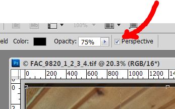
First Things First. I shot with a 12mm lens at an angle, so stuff is distorted. If you straighten the image to make the edge of the medicine cabinet on the left vertical, then the wall on the right is way off. That’s what you use “Perspective cropping” for.

Select the crop tool, clear any presets, then drag to select most of the image. You’ll get a different menu bar at the top when you do, and you’re going to want to select the “Perspective” tickbox as shown.


Now drag the bottom corners of your selection until the edges align with the features you want to be vertical. You may have to play with this a bit. If it doesn’t come out the way you expected, just step back in the history and try again. Photoshop will now create a rectangular image from your selection. If you used to use a view camera with a tilt lens, this is a similar effect. Click in the image to confirm. Magic!


Note that I could have levelled the image here too, but I like the way Lightroom does that, so I saved it for later. OK, what else? There was quite a bit of colour variation across the image. So I used hue/saturation adjustment layers with appropriate masking to vary the colours.I didn’t want the toilet paper roll in the lower right corner, so I used content aware fill to get rid of it. It didn’t work right away, so I had to take it, and the right wall, to a new layer and work there without distraction from other things in the image.

Since I’m really a fan of Topaz Adjust, I opened a duplicate layer with it and used just a little bit of adjustment – in this case I chose the “simplify” preset as a starting point, to smooth the image more. I added a little extra saturation and noise reduction too. Back in Photoshop, I copied the colourful towel to a fresh layer and boosted the saturation. The lights above the medicine cabinet were completely blown out. I copied them to a fresh layer and used the burn and dodge tools to give them a better look with a hot spot in the middle where the bulbs themselves are. There was still too much green in the image so I did a levels adjustment on the green colour channel.


Back to Lightroom. A little tweaking, crop to 8x10 proportion and we’re done. Here’s the final image:


The total time taken to process this image was about 30 minutes. It took me a lot longer to do it again with screen captures, etc so that I could write this up! One thing that amazes me is the lack of apparent noise, given that the camera was set for ISO 3200! And by the way, this was a small room: the width you’re looking at is only 6 feet and the camera was less than 8 feet from the door in the picture. Love that wide angle lens!

– 30 –