What's it all about?

This blog is about photography and photoediting. Its purpose is to provide hints and tips and links to interesting and useful resources for digital photographers, regardless of their level of expertise or experience. It is aimed at people who use digital SLR cameras and who process their images using the latest versions of Adobe Photoshop and Adobe Photoshop Lightroom.

The author of this blog is Glenn Springer and you can read more about him at his web portal at faczen.com. Information on workshops, and links to everything is at photography.to. Glenn's original blog, which is an ongoing journal of his photographic meanderings goes back to 2006 and contains many additional hints and tips, as well as representative images that he has made. Gallery quality prints are available through his Smugmug gallery site. It is an interesting place to visit to see a variety of quality images, as well as an ongoing general journal of photos going back several years.

Photography workshops are scheduled every few weeks starting in the Spring. For an overview of what's happening, please visit the photography.to website.

The most recent blog post is below. Scroll down to the bottom to see the list of previous postings or search for any particular topic.


Wednesday, December 25, 2013

Resizing and uploading images

This post is intended for members of the Haliburton Highlands Camera Club. One reason for being in a club is to be able to share your work with others. Another is to participate in competitions or workshops in order to improve your photography skills. In both cases, you often have to upload images, either to the web, to Facebook, or to a specific site such as a gallery or a forum. In most of those cases, the site has limitations as to the size of the image. Here are a few step-by-step examples of how to resize your images, to format them so that they look good online, and how to upload them.


This looks long and complicated. It is long, I tried to cover all the bases, but each section gives you the easy way to do what you need to do, and then a more detailed explanation of WHY if you want it.


I use several different programs depending on the task. If you use one that I haven't mentioned, this may be of limited use to you, but perhaps it will put you on the right track.

Why do you need to resize your images?

Short answer: "BECAUSE".

There are a several reasons.
  • A photo taken by a modern digital camera can be HUGE. Even the latest round of SmartPhones have 41Mp sensors: each photo could be 50 megabytes in size! That takes up a lot of room on the server, it takes forever to upload it, and people trying to download it use up a lot of bandwidth just to see your picture. 
  • For similar reasons, some sites have limitations on the maximum size they will accept. Most of the forums are like that: for example, TIF (The Imaging Forum) has a limit of 800 pixels wide. 
  • Some sites will allow you to upload huge pictures, then they will reduce the size that they display. FaceBook and SmugMug come to mind. In the case of Facebook, it's well known that the methods they use to reduce your picture to a reasonable size will degrade the picture, both the colour and the resolution, and introduce 'artifacts' that weren't in the original picture.
  • If you're trying to view a picture on your computer, most monitors are only capable of displaying between 1000 and 2000 pixels wide. So a full-screen image on the biggest monitor is going to be less than that. The same thing is true of projectors, which might be used to evaluate your images. And finally,
  • If you upload a full-resolution image, people might be able to steal it and make prints from it or sell it, or claim that it is their own. If you put up a reduced size, it's not printable.
On the other side, you may have cropped an image so that it's TOO small. There are ways to UP-size images but when you do that, you are letting the computer "interpolate" or guess what the missing pixels should look like, and that often leads to ugly results.

What size do you want your images to be?

Short answer: depends what you're trying to do with it.

Here and there you're going to see boxes that let you choose the resolution. You might see numbers like "240 pixels/inch" or "300 pixels/inch" or "72 pixels per inch". Generally the resolution doesn't matter at all. The device you're sending it to will decide. Unless you want your picture to be a certain size in inches, like you would when you print. Multiply the number of inches by the number of pixels/inch and it will tell you how many pixels you need. Work in pixels, not inches.


For uploading to the internet:
  • Normal images should fit inside a frame that's 800 pixels wide and 600 pixels high. 
  • Large images should fit inside a frame that's 1280 pixels wide and 1024 pixels high.
  • Facebook will give you sharper images if you use 2048 or 960 pixels on the long side (height or width). Don't ask why. It will resize it anyway to fit in its framework.
For viewing on your monitor
  • Most monitors show only 72 dots per inch. So if you make your images fit inside 1280 pixels wide by 1024 images high you'll have a picture that's 18" wide and 14" high. Big enough?
  • iPads have higher resolution. Go for 2048 pixels on the long side. (New iPads might be even higher, but I don't know, I don't have one!)
For submitting for competitions or evaluation
  • Our projector likes images that are 1280 pixels wide by 1024 pixels high. Don't exceed these dimensions.
  • Of course your picture might be very wide or very tall: remember to keep the maximum dimension inside that frame.
For printing
  • Printers work best around 300 dots per inch. So to make an 8x10 print, you need about
    2400 x 3000 pixels.
  • Most people can't tell the difference if you have only 200 dots per inch. So 1600 x 2000 pixels might be enough.
How do you resize images?

That depends on what software you're using. Pretty well all of them have that capability, so if you're using one I don't mention here, hopefully you will be able to figure it out.

Photoshop Elements
Short answer: Go to Image → Resize → Image Size. Make sure "Resample Image" is selected. Change the number of pixels in the "width" or the "height" boxes to whatever you want. Press "OK". "Save As..." and give it a new name ending in '.jpg'. 
I only have an older version (10) of Elements, so your screen might look a little different if you have a newer one. It should be very similar, though. If you have an image open, go to the "Image" menu, drag down to "Resize" and over to "Image Size". You can also use a keyboard shortcut, on Windows machines it's Ctrl-Alt-I, on Mac it's Opt-Cmd-I. In both cases, you hold down the modifier keys (ctrl, alt, etc) and touch the "I" key. 


The image I have open here is 6000 px wide by 4000 px high. You'd think that's "ONLY" 24 megabytes, but what you don't know is that there are several layers in this shot and it's over 250 Mb! If you tried to upload it, just 4 pictures this size would be a full Gigabyte! Besides, it's the wrong format. Keep reading!

Now when you open the dialog box, you'll see a window like this:


First thing you need to do is to put a tick mark under "Resample Image" at the bottom. That will activate the pixel dimensions in the upper circle. What that does is to tell Elements you want to change the actual number of pixels in the picture. Now if you go into that upper box (where it says "6003" and change that to "1280" it will automatically change the height of the picture to 853 px (where it now says "4001"). What's going on?


The original picture has a certain "aspect ratio": in this case, it's about 3x2. That means that the height is 2/3 of the width and you want to keep it that way, or it will get distorted! That symbol on the right side of the box shows that you are locking those two values together, and that's what the "Constrain Proportions" tickbox is about.


Elements is designed for people who just want to do regular prints, so it gives a default resolution and size for printing. That "240 pixels/inch" number that you see under resolution is for that. You can safely ignore that box, in fact the whole "document size" area if you're just resizing in order to upload your image.

If you click "OK" at this point, suddenly the picture looks really small on your screen! Well that's because it IS smaller than it was. 


Just click the "Fit Screen" button at the top (or use the keyboard shortcut "Ctrl-0" or "Cmd-0" (that's a ZERO not the letter OH ) to look at it full size. In this example, I've reduced a 250Mb image down to 11 Mb and I defy you to see a difference on your screen!

Next step is to save your image in a format that can be uploaded on the web. BE CAREFUL HERE. If your original image was a JPEG, and if you just click "Save", you will erase your full sized image and write over it with the little version! You need to give it a new name so that your original image will be untouched. Select "SAVE AS" in the menu, not "SAVE".


This dialog box will open. You need to do two things: first, select "JPEG" as your file type (green arrow) and then give it a new name (I would call this one 'redumbrella'. I try not to put spaces in the filename when I'm putting an image up online). 

After you do these things and click "Save", you will have stored the picture on your hard drive, ready to be uploaded.
Note: It took me MUCH longer to type this than it does for you to do it. Two steps: resize the image and save it under a new name. Make sense?
Now here's the same technique for Photoshop (CS, or CC or...)

Photoshop
Short answer: Go to Image → Image Size. Make sure the width and height are showing in pixels, not inches or cm. Change the number of pixels in the "width" or the "height" boxes to whatever you want. Press "OK". "Save As..." and give it a new name ending in '.jpg'.
Ready for this? It's EXACTLY THE SAME AS ELEMENTS. The dialog boxes look a little different, but the functions are the same. These programs were written by the same people!


Just go into the width box and type in 1280. Then when you click "OK" the image will be small, so click "Fill Screen" or "Fit Screen". Note that the box to the right of the Width box has to say "PIXELS", not INCHES. If it says "Inches", you're going to try to make your picture 1,280 inches wide, or over 10 feet wide! Not good! 

The dialog for saving the picture is EXACTLY the same as it was in Elements. OK?

Lightroom
Short answer: Go to File → Export. Tell it where to put the picture. Make sure "resize to fit" is selected and the width and height are showing in pixels, not inches or cm. Change the number of pixels in the "width" or the "height" boxes to whatever you want. Make sure the file settings are "Jpeg" and "sRGB". Click "Export".
This one's a little different. Lightroom is a program designed to catalog and store your original files, no matter what kind of images they are. Sort of like storing negatives in the old days. So to output a picture, you want to EXPORT it. And normally you wouldn't store the exported image in your Lightroom Catalog, just the same way you wouldn't store a print in your negative file in the old days.

OK, so when you have a picture selected onscreen in Lightroom, choose "Export" from the file menu.


A new dialog box will open. Now if you haven't created a bunch of custom presets (if you're reading this, you probably haven't!), you can ignore the whole left side.


Notice where it says "Export One File" at the top? If you had selected 100 files, you could export them ALL with one keystroke! That's a lesson for another day! 


If you scroll down, this is the rest of the dialog box 

What you want to do is tell Lightroom

  • where to put the file
  • what to call it
  • what kind of file it is
  • what size it should be...
  • ...and a bunch of other stuff that's not important here and the subject of another lesson.
So the first two are obvious. Store it wherever you want, call it whatever. The third one is important: you want it to be a JPEG. And make the quality around 80%, you won't be able to tell the difference and it'll be much smaller. Type in the size you want. If you choose "Width and Height" here, you need to put in both numbers. What you're doing is defining a frame to fit the picture in and how it fills the frame depends on its shape. In the example we've been working on, I've used 1280 x 1024 pixels. In the screenshot above, 800 x 600 pixels is keyed in. Click "OK" and you're done!

In Lightroom you can save these preferences so that next time they'll already be in there and you just have to click "Export".

What about uploading?

Now you have this newly created, resized picture on your hard drive, how do you get it up on the internet?

Again that depends what you're doing with it and what programs you have in your computer. Let's take the simple ones first.

Short Answer: these are ALL short answers. There are so many different programs and systems out there! If you're confused, especially if you're an HHCC member, get in touch and we'll see what we can do. 

FaceBook, Google+, Smugmug

When you open any of those sites, they have simple uploaders in place. You can either drag the picture into the dialog, or you can browse for it on your computer and then click "Open" and it will be automatically done for you. 


Simple stuff.

FlickR or other picture sites

I dunno. I don't use them. Probably just as simple.

Your own webspace

If you have your own webspace, you know that's a place where you can upload pages or images or whatever kinds of files for other people to access.

I have my own websites. Generally the Internet Service Provider (ISP) who is hosting your site will tell you how to upload files: it's usually through a mechanism called "File Transfer Protocol" or FTP. There are lots of FTP programs out there.

Details on how to do that are for another day.

Forums, like TIF

Most of the forums use the same software. When you join a forum, you will find sticky instructions on how to upload to it in their FAQ section.

Basically there are two ways to get an image into a forum:

  • Upload it to the forum server itself. They don't usually like that (but they tolerate it), especially if your image takes up a lot of space.
  • Upload it to your own webspace, then put a link to where the picture is in the forum post. That's the preferred way
  • Most forums have a limitation of 800 pixels wide x 600 pixels high as a maximum.

Sunday, November 3, 2013

Temporary Photoshop Fix for unsupported cameras

Adobe hasn't yet updated Lightroom or Photoshop to support my new D610. So I can't import any of my RAW files to either program. I researched a temporary fix.

Note: This may not work in principle for other cameras. It works for the D610 because the RAW files are almost identical with the D600. Down the road, a similar fix might work with other cameras but you have to figure out what to try.

What you need to do is to rename the camera model in the EXIF data in the RAW file (in my case, they are ".NEF" files). To do that, you have to run a program to edit the metadata.

Note: this is for Windows 7. I'm sure Windows 8 is similar, but I'm also sure the Mac is different. There is a Mac version but I'm not going to try to tell you how to use it.

Here's what you have to do:

  1. Get exiftool.exe
  2. Upload the pictures from your camera to your computer
  3. Run exiftool on the whole batch of pictures. Has to be run from a command prompt.
You'll end up with files that you can now import into Lightroom or open in ACR.


OK, here's how. This may look long, but just do it step-by-step.


  • You have to unzip it and put it somewhere you can find it. For me, the easiest place was on the Desktop.
  • The filename is "exiftool(-k).exe". The "(-k)" will keep the window open when you run it from the command prompt, which you need to do if you're going to use the program just to view the exif data for an image (what the program is really for!). So right-click it and make a second copy on the desktop, then rename the copy to "exiftool.exe" so you can use it more easily to rename the camera model in a batch of files.

  • To run the program, you have to do it from the command prompt window. Click the Windows Start Menu icon (the beachball in the lower left corner) and type the word "command" in the search box. The first item that should come up is "Command Prompt". Click it. A black window will open up.


  • To run exiftool from the command prompt, you have to type the entire path, both to where the program is and to where the files are. To avoid having to do that every time, I decided to save the entire command in a text file so I could just cut and paste it into the command window. 
  • As it stands, the default command window doesn't allow you to simply cut and paste into it. Make it happen by right-clicking in the bar at the top of the black window, select "properties" and turn on QuickEdit Mode in the options window. That should be sticky.

  • A word about importing the files to the computer. Since my auto-import to Lightroom doesn't work on these files, I connected the SD card, viewed the files, and dragged the entire subfolder called 100ND610 (inside the DCIM folder on the SD card) to the desktop. After I import to Lightroom (including copying the files to where they're supposed to be), I can simply delete this folder. It's always the same name, so I don't have to retype the command line each time.

  • I opened Notepad and I typed in the following (of course replace the CAPS areas with your own info):
    C:\Users\YOUR-USER-NAME\Desktop\exiftool.exe -model="NIKON D600" C:\Users\YOUR-USER-NAME\Desktop\FOLDER-WHERE-THE-PICTURES-ARE\*.nef
    Note that this command is continuous, all on one line. Blogger has split it to fit the window.

    In my case, the exact command was C:\Users\Glenn\Desktop\exiftool.exe -model="NIKON D600" C:\Users\Glenn\Desktop\100ND610\*.nef
  • Copy that from your notepad file (I saved the notepad file as "using exiftool.txt" on my desktop) and paste it into the command window. To paste into this window, you DON'T use ctrl-V, you simply right-click anywhere in the black window. Once it's there, click to run it.

  • If you have multiple files, it will take a minute of clicking and whirring before it's done. Then it will tell you, "x files have been changed".
Update: Open the window with the files in it before running the program. You can watch its progress! I just did about 100 files and it took about 5 minutes. I thought it was stuck until I opened it and saw it going through the files.
  • Now you can open Lightroom and use your usual import workflow, but your source files are the ones in the folder on the desktop, not on the SD card.
Phew! They don't make it easy, do they?

BONUS: you can view the metadata for any pictures by simply dragging and dropping the image file on top of the exiftool icon! Use the one with the (-k) in it so it will stay open for you to read it. You will be blown away by the amount of information your camera collects. Your shutter count will be about halfway down the list, by the way. This should work for ANY picture file, ANY camera.


Update: It seems most cameras do NOT show the shutter count in the EXIF. I tried several others and heard from readers who couldn't find it.

So that's how I did it. Good Luck!

* If you liked this post, please share it, by clicking the "+1" below or "Like" on FaceBook. Please visit my regular weekly blog at http://www.faczen.blogspot.com and sign up for the free weekly newsletter. Don't worry, you can unsubscribe with one click if you want to (but you won't want to!)


— 30 —

Wednesday, May 29, 2013

The making of a printable image

My friend George is new to Photoshop. He has a great eye and judging by the pictures he takes, he must have a really good camera! I sent him an image a couple of days ago and he asked me how I did it. So when I wrote my reply, I thought it might be instructive to write it up for others, and document it a bit with screen captures.

If you're expecting a really hotshot tutorial, you're going to be disappointed. I didn't do anything really fancy. Just what I consider a reasonable workflow in Photoshop. I'll try to explain why I did what I did as I go along, but sometimes I don't really know why! So here goes nothing!

To start with, here's the FINAL picture. You can click on it to see it full-screen.
Sorry about the ugly watermark. You do what you have to do in the Blog world. In this case it's not very obtrusive because it's outside the image area.The signature is there, though, because this is a limited edition print and it gives me a chance to show how I made it.

Step 1: the capture
This motorcycle was parked in front of the Red Umbrella Inn across the road. I had a DSLR course student and we wandered over to do some shots and I said, in a teaching moment, "take 15 pictures of that bike and make them all different". While she was doing that, I did too, except I already had in mind what I wanted to get. Here's the bike in the original image, untouched:


These are all screen captures, by the way, so I'm not sure of the image quality 


You may or may not be able to see the wall and the bushes behind the bike. It certainly wasn't completely black. Here, I'll artificially crank up the levels so you can see it:


There. See it now? This is more like it looked through the viewfinder.

When I shot the picture, I deliberately underexposed by a couple of stops (I metered on the yellow cowling, exposure compensation at -2ev, 1/4000 sec at f/2.8, ISO 100, 70mm). Don't ask why I was at f/2.8, I just was, OK?

Step 2: Photoshop
Unusual for me, I didn't touch the image in Lightroom after I imported it, except to set the "Pick" flag. I took it immediately into Photoshop CS6.

I duplicated the layer and used curves to deepen the contrast. I also used the healing brush, content-aware-fill and the clone stamp to get rid of virtually everything below the gas tank and headlights.  Then I duplicated the layer again and set the blend mode to "multiply". That darkened the blacks and made the yellow more rich.


That left some ugly artifacts in the headlights, so I added a layer mask to block them out. 

Next step was to make it more crisp, so I ran a high pass layer. You do that by duplicating the layer and setting the blend mode to "overlay". Then choose "High Pass" from the filter list (it's under "other"). A comfortable level for me is 4 pixels, to keep the image from going over the top but YMMV.

I "stamped" a new combined layer and ran content-aware-fill on a couple of highlights that I thought were distracting. But the windshield was gone, and I really needed that to balance the image. I used levels to bring it back but I masked everything else out so as not to affect it.


It's there, but not good enough. Nothing seemed to work... 

So I decided to bite the bullet and paint it in. Using the pen tool and a Boolean curve, I traced the edge and then using a small pencil brush, stroked the path I had created. It was too strong, so I faded it back, then I used a non-destructive dodge and burn layer to soften it. You do that by creating a blank layer, fill it with 50% grey and change the blend mode to "overlay". Now everything you darken is burning and lighten is dodging, so I used soft brushes at low opacity to do that smoothly, and even a gradient to make it fade away at the top.


One final step. I stamped one more layer, then I ran the new plug-in, Topaz Clarity. (you can get it here. On sale for $29.99 until May 31/13: use the promocode "claritynew"). This allowed me to fine tune certain areas and details.

Almost done. Now to prepare it for print, I did two more things. Jim sent me an action to use to prepare images for printing on his Epson 7900. It resizes the picture (my go-to size is 13x19, on a 24x18 size sheet) and puts a border around it. It also lets me insert a name for the image. And I add the signature on a new layer so that I can change its color, size and opacity without affecting the image. The final product is at the top of this post.

The last thing you need to do before printing is to soft-proof the image for the printer/paper combination you're using. That's not for this little tutorial.

A word about the signature. My handwriting is, well, "awful" is putting it mildly. I can't write my name legibly. So hand-signing images is a challenge. I've opted to digitally sign, but on art images, unless you're already famous, the signature has to be legible. It took me probably 500 tries to write "Springer" in a way that it was legible and looked OK. I struggled with my first name, and was never able to achieve it. In frustration, Rosa picked up my stylus and wrote the "G" for me! (actually no she didn't! I remember now that she did it with her finger on my iPad!).

I created a brush in Photoshop to "stamp" my signature. Here's what you do, it's really simple. Scan in or create your signature and open it in Photoshop in black ink on a white background. Make it large enough so that it will be high quality at size: I used about 1000 pixels wide. Now from the edit menu, select "Define Brush Preset".


Give it a name and you're done! Your new signature brush is in the list of brushes. Just select it and click wherever you want it to appear. Use a new layer and you can modify its appearance as you wish. Don't forget to save your brush set just in case you have to reload Photoshop or you want to take the brush set to another computer. You do that here:


Summary
I may not be done with this image. As I look at it, I wonder how much better it might be with the headlights ON. When I have some time, I might revisit it with a digital paintbrush in my hand!

Note: as I re-read this, I notice that some of the things I did are not that simple. They are for me because I do them all the time, like "stamping" a new layer, using the pen tool, or creating a non-destructive dodge/burn layer. You can Google all this stuff, or hit help in Photoshop for more information. Work with it a few times and you'll learn how.

I hope you enjoyed this simple example. Please join the Newsletter Update list so I can give you a heads-up about new posts when I make them, and give you some free stuff.


— 30 —

Saturday, April 13, 2013

Printing and mounting followup

As I mentioned on the FACzen Image blog, I have some more research information and I've received some sample prints on 3 different media. Here's an update.

Watercolour Paper

I ordered a 12 x 18 inch watercolour print from Posterjack of this image:


The Trent-Severn waterway, with Balsam Lake in the background.  


It is outstanding. When I pick it up, it feels like something you would find in a museum. The matte finish and smooth tonality give an entirely professional feel to the image and I would have no hesitation about asking $200 for this unframed, unmatted print. It is archival quality, with 100-year inks, and the finish is unblemished. Of course it is printed without the watermark in the corner.

If you are reading this here and want a print, contact me and we'll talk. The price is negotiable for my readers.

Acrylic Mount

This medium is also outstanding. I made a 12 x 36" pano of my bicycle shot, and here's an iPhone picture of the print, together with a slightly smaller lustre-finish print that I'll talk about below.


Bicycles for Rent, the Old Brickworks in Toronto. The bottom print is acrylic, the top one lustre-finish 

When I first ripped open the shipping box with the acrylic print in it, I was initially dumbfounded.  It was blue. You couldn't see the image unless you held it up to the light. I thought for a second that I had made a huge error! Then I realized that it had a protective coating on it! I peeled it off and saw the print underneath!

My initial reaction was a little disappointed. I expected it to glow radioactively. It doesn't: until you shine a spotlight on it! The brighter the light, the more it jumps out at you! But it's interesting that it doesn't look very much different than the regular lustre-paper print above it. In the iPhone picture, I had two spotlights from my ceiling track lighting pointing at them from about 10' away. They are standard 50w halogen spots, and because they were off to the left, the lighting was stronger on that side of the image.

I realize now that acrylic is a wonderful mounting medium. The ones from Posterjack come with four brushed aluminium standoff posts and hardware, and the image is pre-drilled to accept them. It will hang on the wall with a gap of about 1/2", perfect for a 3-dimensional look. It's a different, and entirely professional alternative to matting and framing a print behind glass. The manufacturing cost of a frame, especially in a custom size, would be at least as much as the cost of the acrylic print.

This print is available for purchase. It is $300 for my readers and will be listed for sale at the Haliburton Home and Cottage Show for $450. Contact me if you're interested.

Lustre-Finish Giclée Print

The word "Giclée" is a fancy term for "ink-jet". It implies that it's a better quality than your average desktop inkjet printer, and I would only use it to describe prints done on quality paper, with multiple pigment-based inks. The one in the picture above was done on Jim's Epson 7900 printer, on Epson Premium Lustre 260 paper. The paper comes from a 24" wide roll, and the print is just short of that width, so it's practically an 8" x 24" image.

Now Jim is a master at printing. If I hadn't already given Ron the nickname "Yoda", I'd give it to Jim. He walked me through every step of preparing that image for print and didn't miss a trick. I'll be doing many more prints with him, and hopefully I have learned enough to prepare my images for him, but I know he'll tweak them anyway. For I am but a grasshopper...

But I digress. This print is almost indistinguishable from the acrylic one. In fact it seems to have richer blacks but that could be the lighting. It is crisp and brilliant and would be a $150 image if I put it up for sale (let's talk...). Certainly it's worthy of display and I would be framing it if I didn't have the acrylic one.

All three of these are viable, exhibition and art-print quality media. You can't do the acrylic version on a home or small shop printer, it needs huge equipment to produce it. The watercolour and the lustre-finish papers can be run with Epson machines. I might be interested in doing some printing myself: Jim made me understand that the Epson 4900 is the better machine to buy than the 3800 but I probably can't afford one right now. If someone has either of those for sale in good shape, I'd be interested. Please contact me.

In the meantime, I have a lot of work ahead of me to prepare images for the Haliburton Show. I'll be doing some canvas as well, and some smaller card-sized pictures.

More to come when I learn more!

— 30 —

Sunday, March 31, 2013

Printing and Mounting options

This blog post is about exploring some print media and mounting options. It's preliminary; the thought process I'm going through right now in anticipation of doing some exhibition quality printing.

This is an open-ended post. I'm continuing to research the topic and I'd value input, either by email directly or by comment to this post. I am giving some thought to starting to do my own printing, but I'm not there yet (if anyone has a 13x19 printer that uses pigment inks like the Epson 3800 that they want to get rid of, let's talk!).

I don't presently do my own printing. I never have, in 50 years, except for black and white way back when. Not that I wasn't interested, it was just that I didn't have the expertise or flair for it back then, and it was important to "do it right" or not at all. I used to go out to photo labs in Montreal (the names escape me), but in the digital era I've done a few prints at MPix and Bay Photo, but not much else.

Yes, I've used Costco for some run-of-the-mill lower end stuff and will continue to do so when quality isn't a high priority (and cost is!). Lately a friend has offered to print for me (not sure if he wants his name out there so I won't publish it). He has a large scale Epson printer, TONS of expertise and great attention to detail. He told me he needs to keep his printer busy or the ink dries out.

That said, I am now at a stage where I want to have some high quality prints, both for my own display and for art images for sale. So I've been looking into some options. I've discovered that there are quite a number of national and international sources of quality printing but they're not cheap. There's also mounting considerations.

I want to comment of a few of the options.

Metallic Prints

There seems to be two schools: printing on "metallic looking paper" and printing on metal itself.

I saw some real metal prints at a gallery in the distillery district a couple of weeks ago. Also at the Artist's Project show. Rosa loved them, I didn't particularly. There are no whites: white is replaced by the colour of the substrate. Just not my cuppa tea. There are shops around who will print on metal, including PosterJack in Toronto.


This is the kind of image that I think might work well on metal.  


I had one print made on metallic paper at Bay Photo (this is the outfit in San Francisco, I ordered it through Smugmug). I ordered their "Thin Wrap". The print I got was quite good, The only thing I didn't like was the way the edges didn't wrap really tightly around the backing so it doesn't appear perfectly flat.

This is the actual print I had made on metallic paper and thin wrap mounted. It's hanging in my bathroom so it gets all kinds of moisture issues but hasn't degraded at all, as far as I can tell. I made a mistake on the actual print, I didn't allow enough room at the bottom for the wrap so the cropping isn't correct.
Acrylic Mount

The acrylics are astounding. When I first saw one, I think at the One-of-a-Kind show last fall, at first I thought I was looking at a backlit transparency. Blew my mind. Investigating further, I discovered there are a few places that do that, but it's not cheap. There are a couple of different processes out there. Colourgenics does an "acrylic face mount" where the actual print is sandwiched between two sheets of acrylic. It's very expensive: just the mounting for a 360 square inch image was quoted at $300.

Posterjack quotes somewhat less, but they say that they print directly on the back of an acrylic sheet. I'm planning to run a test with them, with this image:


The original file is 4100 pixels wide, I've upsized it to 5400 pixels and plan to print a 12x36 pano.  


The best images for acrylic mounting are highly saturated or brilliantly coloured ones, the kind of thing you would print on ultraglossy paper.

Canvas Wrap

A lot of places — including Costco — do canvas wraps. I don't know enough yet to know the difference. I am planning to do the following image, but I think my friend is going to produce it for me:


It's one image, cut into 3 pieces, a "Triptych". Each piece will be 9" x 18", with the edges mirrored. This original picture was taken quite some time ago, the first week after I got my D300. I used Photoshop CS6 to do the "oil painting" effect. 
Another picture I'm considering for canvas is the following:


Again it's a Photoshop oil painting. The difficulty here is that it was drastically cropped from a D600 image and it's only about 1600 px wide. I think I can take it to a 12x18 because the oil painting effect will negate any pixillation or artifacts, but we'll have to see.

Watercolour Paper

there are inkjet papers out there called "watercolour papers". Again, I first saw this at the Artist's Project show. The matte finish, subtle toning and wide dynamic range makes it ideal for pastel images. It is museum quality and availabe quite heavyweight.

Some candidates for watercolour paper printing:


The primary manufacturer seems to be Hahnemuhle. I saw samples at Colourgenics. It's spectacular for pastels, and has a phenomenal matte finish. I'm not sure where to buy it (I can't find the right one directly at Hahnemuhle, but Vistek lists a 50-sheet package (13x19) for $285) but if I were printing myself (and the thought is percolating in my mind), this would likely be my go-to paper.

Mounting

As mentioned above, any prints that I have mounted now were bought that way or sent out. I do have a handheld mat cutter that has not been out of the box yet, and some sheets of mat paper and some 18x24" frames. I'd like to be able to mount prints on foam core if I can find an easy way to do so. I have the space to work in, but no equipment. Again, I'm open for suggestion.

By the way, if you are interested in purchasing any of the above images, please contact me! Until I'm fully established in the printing game, expect introductory pricing. Now is the time!

Wednesday, January 23, 2013

Light Pucks at Costco

Just a quick heads-up: get thee over to Costco and buy these "Light Pucks" for $29.


Quick iPhone grab

They are about the size of a hockey puck (as the name implies), they're wireless, powered by 3 x AAA batteries, blue-white LEDs, bright and absolutely ideal for use in still-life situations like shooting in a light tent. They come with a remote control but by pressing on the light, you also turn it on.

As I write this, I haven't finished unpacking them, I just took one out to try it as you can see. And batteries are included! 


Test shot in the light tent with just the one Light Puck, no other light. The puck was on the camera axis, low, shining up at the clothes pin which was on the plastic sweep. The lines underneath are from the tupperware boxes holding the sweep up.

Imagine the nice even lighting from several of these pucks!

Only $29 at Costco. They were on the end of an aisle near the household goods section. By the way, the remote control has a dimmer and timer function, it says. No wires make it really easy to place these in and around the subject!

I'll add to this post after I get them all unpacked and try them out.

Wednesday, January 16, 2013

Get yourself a Light Tent

Today I’m going to talk about light tents. It’s a great solution for small product photography that lets you achieve professional results with minimal effort and cost.

This article is a lot longer than it needs to be. I could do it in a single phrase: “buy a light tent, use whatever lights you have or even just daylight, pay attention to detail”. But I hope you’ll enjoy the story and extra info that follows.

There’s an old business saw: “you can have it fast, you can have it cheap, you can have it good. Now pick any two.” Basically I like doing things the easy way, I’m a cheapskate and I want professional results. Generally you can’t achieve all of those things at the same time, but that’s what I want. A light tent goes a long way towards doing that for you.

I’ve had a light tent for a long time. I realized early that most good small product tabletop shots have 3 things going for them: soft, even lighting without intrusive shadows, a really clean background, and crisp focus. One way of achieving that is to invest in a brace of studio lights and light modifiers, build a stage with a custom sweep, and use a 4x5 view camera with associated stainless steel darkroom and nitrogen burst gaseous agitation system for developing consistent negatives. Another way is to put a DSLR on a tripod with a reasonable lens, get a light tent, and light it with whatever you happen to have on hand.

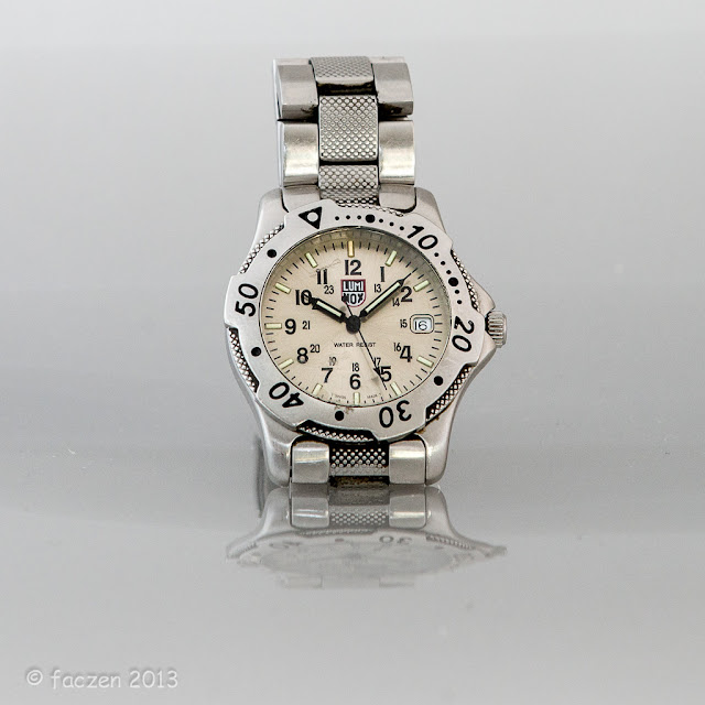
Now you realize that when I said that, my tongue was firmly implanted in my cheek because of course you’re not going to be shooting a national corporate ad campaign for Apple™ or Coca-Cola™ with that little setup, but how many of us do that? No, what we do is put a used MP3 player up on eBay (you know; one that’s fallen from a third floor window onto a concrete sidewalk and is smashed beyond repair. You list those as “may show some signs of wear and tear”! LOL), or take a picture of your watch because you’re bored and it’s snowing outside, or have some small products to show on your online small business site.

What is a Light Tent?

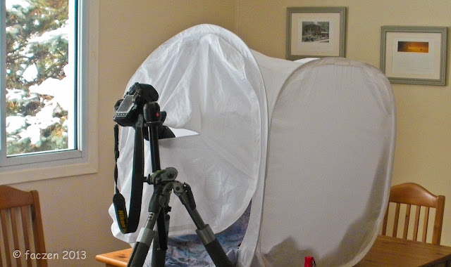
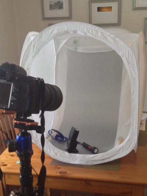
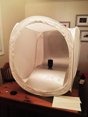
There are various other names for it, but basically it’s a cube, made of sturdy, white translucent nylon, usually framed by springy steel. aluminium or fibreglass poles or hoops so you can fold it down for storage.


The panel with the slit in it that the camera is poking through is important when you're shooting objects that show shiny reflections. More below...


(An aside here. I could not, for the life of me, figure out how to fold my tent down into its original package, which is a saucer shaped bag about 30cm in diameter. You have to hold it “just so”, twist it “like this” and lo and behold, it folds up! Once on a weekend photoshoot, I offered a prize to whomever could fold my tent up. Kathy looked at it for a second, picked it up and within 10 seconds, handed it back to me neatly folded. I begged her to teach me. I couldn’t get it. Then Rosa said, “look on YouTube”. “Nah, it wouldn’t be there...” wanna bet? There have to be 100 videos showing you how! Finally! I got it!)

When it’s open, the inside is completely white. Shine a light on one or more sides and you have a huge, even, light source. But because light filters through the sides, even putting it on a table near a window gives you great, soft illumination! You can also put a light inside it, pointed at a wall or the top, and again, a big, soft, even, shadow-free light source.

Where do you get one and how much are they?

Google is your friend. All the photo sources carry them: B&H photo, Amazon Canada, Amazon USA, your local camera store or... well, eBay! I bought mine on eBay, it came from Hong Kong in about 2 weeks and cost me $35 including shipping. You can get little ones even cheaper if all you shoot is small pieces of jewellery, for instance, but I bought one that was about 1m cubed. They also come big enough to shoot people in them!

The stores also sell kits including light stands, floodlights, etc. As much as $1000! Whatever floats your boat.

Light Sources

Now if you want the light to be really even, you should light up more than one side. The fact is, though, it doesn’t matter what you use for a light source. Studio strobes, remote Speedlights, continuous floodlights, or even ordinary light bulbs! You have to watch the colour temperature, of course but unless you mix them, you can easily compensate in the computer, often with one mouse click. My favourite light source is daylight from a nearby window and a single remote Speedlight. As I said, you can often get away with just one.

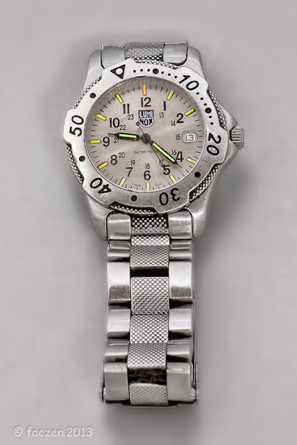
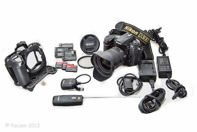
They don’t have to be particularly bright either. You did see where I said “tripod”, right? The watch shot here was a full 10 seconds. The camera kit shot was a short exposure shot with one Speedlight.


10 second exposure at f/8, ISO 100. Some light was from a Speedlight directly behind the subject, but most was from a flashlight shining directly on the watch, that I was waving around during the whole exposure.

Here's a good question, though. Why is the second hand visible? It was not in one place long enough to be lit by the flashlight, but the Speedlight shouldn't have picked it up either because it was not shining on the watch face! It's a mystery to which I do not have a good answer.


1/125 second at f/14, ISO 400. In this case, the subject stuff was sitting directly on the white cloth sweep. I cranked the whites up in Lightroom and added some detail enhancement in Photoshop/Topaz. This D300 kit is still for sale as I write this, contact me if you're interested in a great deal.


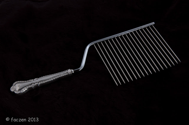
I admit that this shot used multiple light sources. It didn't need to, though. This was done back when I had a full set of studio strobes and I lit both sides and the top of the tent with them. The background was a furry acrylic thing I happened to have around.

It's important to be able to move the Speedlight around, so you need to get it off the hotshoe on your camera. Especially if you're shooting with just the one light, where you put it and where you aim it affects your shot tremendously.


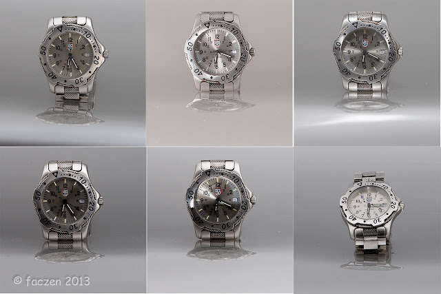
Here are 6 different exposures of my watch lit ONLY by the Speedlight, but in different spots. The reflections underneath are from the plastic sweep that I describe in the next section. 


Backgrounds

You want your subject to be evenly lit, but you also want it to be on a clean background. White, black, coloured, patterned, reflective... it’s easy to achieve all of those things with a sweep. That’s a technical term for a curved, seamless background that starts above your image frame and ends below it. Your subject can sit on it or be suspended in front of it and it can be as invisible as you want.


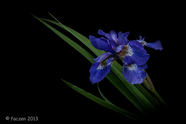
On a black background (obviously!). I shot this outdoors, with the light tent in the shade not in direct sunlight. I used a little flash fill to bring out some textures and details. 


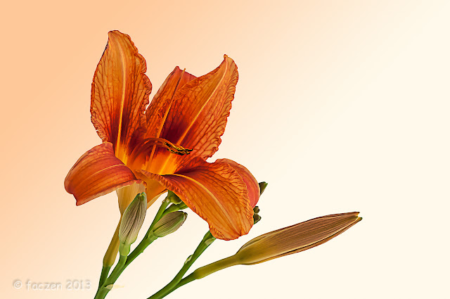
Here's another flower shot, same setup except a white background. I sampled the orange of the flower in Photoshop and toned the background with a tint of it. The Speedlight was in the back so I could get light shining through the petals. 

Most light tents come with a few different sweeps. Mine had a white one and a black one but I used a variety of different pieces of cloth for the same purpose. The tent has little Velcro tabs you can attach the sweep to, but in a pinch, a couple of ordinary clothespins will do.


This is that piece of plastic I describe in the text, just lying in the tent. 


Remember I said I was lazy? If your background is wrinkled or dirty, you may need to spend some time in Photoshop to remove the shadows, marks and creases. So try to keep them clean and use a wrinkle-free material. Or if you strongly light the background behind your subject — which you can also do from outside the tent with another light of some description — all those things get blown away. The other extreme is to use a black background and try to shade it from the light.

Sometimes you want your subject sitting on a reflective surface. That adds tremendously to the 3-dimensionality of your picture. What I did was to go to a local sign shop and had them make up a translucent, flexible piece of plastic. They used a neutral gray for me and I paid $30 for a meter-long piece. Two Velcro tabs on the top and a little stand underneath — you can make it from wooden dowels or wire hangers or even old (clean!) chopsticks, and you’re done. An even better solution: use a Tupperware™ container as a support underneath. By raising the subject up, you can now light it from below as well!


The plastic sweep is sitting on top of a Tupperware container. I put a Velcro™ strip at the very top to hold it in place. 


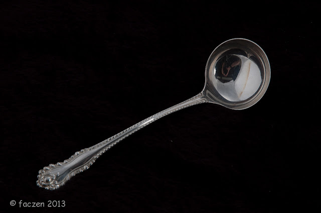
One thing you need to watch out for are reflections of you and your camera when shooting shiny objects. Most of the light tents come with a shoot-through panel with a slit for the lens. I can’t find mine right now but an old bedsheet and a pair of scissors should fix that in short order!


What happens if you shoot shiny reflective things without bothering to hang the shoot-through panel. Look at the reflection in the bowl of the spoon!


Example

Here’s a shot I did this week because there was a competition category on the TIF forum called, “jewellery” and I didn’t have a lot of time to shoot! In fact, the competition ended at midnight that day, and I got home just before 9pm, tired after a 2-hour drive, and hadn’t yet eaten. I had to clean off the dining room table, set up the tent and shoot. I was basically done by 9:10 but I got carried away and kept going for a few minutes more because I wanted to try something.

What I did was to stick the watch on my plastic background using green removable tape. I didn’t feel like changing lenses so I just used the 70-200 that was on the camera, and on a tripod, with VR turned off, I stopped down to f/8, put my Speedlight beside the tent and took a shot or two. Done. However I wanted to blow out the background, so I moved the Speedlight directly behind the tent (it still sensed the controlling flash from the pop-up) and used room light to illuminate the tent. Ugly, because the room light was tungsten.

My Luminox™ watch glows in the dark. It has little radioactive Tritium capsules that are really bright, the same ones used on the night sights on a Glock™ pistol. My goal was to see them in the picture, so I didn’t want to do a lot of front illumination. So I locked the shutter open for 10 seconds, went and got a little LED flashlight that’s more daylight coloured, and waved it around at the watch. The strobe was all done doing its thing after a few milliseconds and I could play with light painting all I wanted after that.

Here’s another lesson: pay attention to detail and (a) you’ll have better results and (b) you’ll have to spend less time fixing things later in the computer. This applies to all kinds of pictures, not just still life and product shots.


Here’s a before-and-after. On the left is the original image right out of the camera, on the right, the finished shot. It took me about an hour in Photoshop and Lightroom to make the following edits:

The watch was dirty. I should have taken a minute to clean it before shooting it. Look at the bottom of the bracelet on the right side and in the middle.
  • There was a scratch on the crystal at 11:00. I had to clone the “1’s” from the 10:00 and remove the scratch with the clone and content-aware healing brush tools.
  • There was a bit of glare at top left which I burned back and cleaned up.
  • Contrast adjustment on the little date window and I painted out some dust and dirt here and there. Not sensor dust, "dirty old watch dust".
  • I increased the saturation to bring out the colours of the light capsules, then used a masked layer in Photoshop to limit the increased saturation to those spots. I reduced the overall saturation because there was a bit of a pink glow (probably caused by the tungsten lights in my living room that intruded in the 10-second exposure).
  • The bracelet and watch weren’t completely straight. I used Puppet Warp to straighten them. I could have done even more but I figured it was good enough.
  • Background spot removal. I need to clean my sensor again... then I opened a fresh masked layer and used a Gaussian Blur to soften out any background artifacts. Again, I could have done a bit more work on this.


1:1 blowup of the image. Amazing how much detail is visible. Of course some of that is due to the excellent sensor in the D600. I shot this with the 70-200mm lens from quite far away. A macro lens would have made it spectacular. 


So the shot and setup took less than half an hour, the Photoshop stuff longer because I didn’t pay enough attention in setup, and because I was having fun playing with it!

Something completely different!

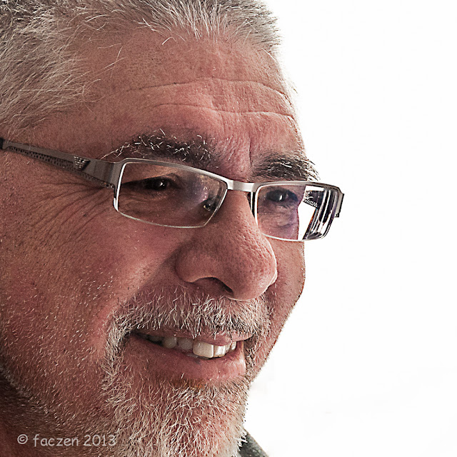
Here I used the light tent for a completely different purpose: I used it as a flash modifier, in other words, as a light source!


The glowing white background that you see is my Speedlight shining through the light tent from behind. Obviously I'm not inside it. I had a silver dish reflector off to camera right that threw light on the face and the Speedlight was the ONLY illumination! 


Summary

A light tent is a great investment. I’ve even used it as a soft backlighting source for this Avatar shot of me (one light source, my Speedlight directly behind it, and a reflector in front of me to camera right to light the face). How else can you get a custom, professional looking lighting setup that pops up in no time and costs you under $50?


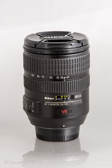
My well-used 24-120mm lens. The setup is shown in the iPhone shot a few pictures up, with the lens sitting on the sweep. The Speedlight is about level with the lens and pointing through the right hand side wall at about a 45° angle. You can see every fleck of dust, every scratch and wear mark on the lens. Not necessarily a good thing if this were a shot intended for a sales listing on eBay or Kijiji!


One more picture. I'm sure you're tired of looking at my watch. But this one was shot at, well, about 10:08 am using the ambient light from a west-facing window and NO flash. I have not cleaned it up at all: it's just as it came out of the camera, except for cropping, exposure adjustment and a little clarity tweak in Lightroom. Look at the great even lighting!


I’d enjoy seeing some of your shots... send me some links and I’ll append them at the bottom of this article.

— 30 —