What's it all about?

This blog is about photography and photoediting. Its purpose is to provide hints and tips and links to interesting and useful resources for digital photographers, regardless of their level of expertise or experience. It is aimed at people who use digital SLR cameras and who process their images using the latest versions of Adobe Photoshop and Adobe Photoshop Lightroom.

The author of this blog is Glenn Springer and you can read more about him at his web portal at faczen.com. Information on workshops, and links to everything is at photography.to. Glenn's original blog, which is an ongoing journal of his photographic meanderings goes back to 2006 and contains many additional hints and tips, as well as representative images that he has made. Gallery quality prints are available through his Smugmug gallery site. It is an interesting place to visit to see a variety of quality images, as well as an ongoing general journal of photos going back several years.

Photography workshops are scheduled every few weeks starting in the Spring. For an overview of what's happening, please visit the photography.to website.

The most recent blog post is below. Scroll down to the bottom to see the list of previous postings or search for any particular topic.


Showing posts with label Photoshop CS5. Show all posts

Saturday, May 28, 2011

Perspective Cropping in Photoshop

On the NAPP forum, someone was asking for advice because the pictures he was cropping were getting distorted, faces elongated. I suggested that perhaps he had the Perspective box selected when he was cropping. I still don't know if that was the problem, but the following is the answer I wrote. The question I was responding to was, "so what does the perspective box do?"

Some of the tools in Photoshop are mysterious when you haven’t used them regularly, if at all. I think the perspective cropping tool falls in that category.

OK, a picture is worth 1000 words. I just grabbed a shot of my grandson who REALLY, REALLY, REALLY needs a haircut. Here's the original, trimmed down to fit better here.


I decided to crop it to an 8x10 ratio.


Notice that this is without the perspective box selected. If I drag a corner, it keeps the same aspect ratio, just includes more or less of the image.

Now I did it again with the perspective box ticked:


Nothing else changed, except I dragged the top down and the bottom up. Doesn't look like an 8x10, right? But here's what you get when you invoke the crop by double clicking inside the selected area:


Elongated face! The reason is that with the perspective box selected, the cropping tool will take whatever's selected and make it fit in an 8x10 aspect ratio. It will stretch or shrink it as necessary to make that happen.

I'm guessing this is what's going on for you.

The perspective control is a very powerful tool. You can use it to make lines that are not parallel, parallel (couldn't think of a better way to say that. Oh wait: a picture is worth...)


Drag the cropping rectangle (OK, not a rectangle any more, a quadrilateral) until the sides are parallel with the things you want straight up and down or sideways


Magic!


Perspective cropping in Photoshop. That's how it works.

— 30 —

Monday, April 18, 2011

Non-destructive Dodge & Burn in Photoshop

I came across a really neat trick the other day and I would attribute the concept if only I could remember where I read it! I didn't come up with this, I found it but it's so neat that I had to share.

You can always dodge (lighten) and burn in (darken) non-destructively by creating a duplicate layer and working on that layer not on the original or background layer. But if you want to change the effect, you have to do it the whole layer at once.

This trick works just like painting on a mask: you can reverse the effect by switching the colour (black or white or a shade of grey) that you're painting with. Here's how it works.

Open an image you want to work on and create a new layer


Fill the layer with 50% grey


Change the blend mode to "Overlay" (you can also use "Soft Light") and rename the layer "Dodge & Burn Overlay" so you don't forget what it is.
         Here's how it works. In overlay mode (or soft light), blending 50% grey with your image has no effect. However if you LIGHTEN that grey, it SCREENS your image, or lightens it. If you DARKEN the grey, it MULTIPLIES the layers or darkens it.

Use a brush at relatively low opacity (say 20%)


Paint with black or dark grey on the overlay layer in those areas you want to darken

Paint with white, or lighter grey, in those areas you want to lighten.

Of course, you're looking at your original image while you're painting. If you turn off all the other layers, here's what the overlay layer might look like after you've painted on it:


Want to lessen the effect? Switch colours (the "X" key will toggle between the foreground and background colours) and paint over the area you want to change. Don't like what you've done? Paint with 50% grey and the changes are gone.

This works for saturation too! Not quite the same way, though. Create another blank new layer, and change its blend mode to "Saturation".


ANYTHING you paint on that layer will reduce the saturation of what's underneath it – doesn't matter what colour you paint with. Use a low opacity brush and paint over the offending brightly coloured bit. If you do too much, use the eraser tool on the saturation layer.

A really slick method of non-destructive dodging and burning that gives you precise levels of control, and it's easily reversible.

Here's an image I shot today that I used this technique on:


The rock in the foreground was too dark so I dodged it. The embankments in the distance were too light, so I burned them in. The orange leaves near the bottom were too brightly saturated. The rock face on the right needed to be darker. I made all these gentle changes by painting on the Dodge & Burn or the Saturation layers I created. The whole thing took 5 minutes, not including doing screen captures for this article!
This image itself wasn't that simple. It was a 5-shot HDR created in Photomatix Pro 4, then imported into CS5. These were slow exposures shot at ISO 100, with an 8x ND filter on the lens and aperture set to f/29. Shutter speeds ranged from 1/13 sec to 1.3 seconds. I selected the water and put it on a new layer and then applied Topaz Adjust 4 smoothing to it. I selected the underlying layer (everything else) and applied Topaz Adjust but in detail mode to that layer to bring out some sharp details. I did the dodging and burning I described above. Back in Lightroom, I used the adjustment brush to further soften the water, and we're done.

I'm not sure I got the effect I really wanted, but it's pretty close to what I had in mind.

-- 30 --

Sunday, April 3, 2011

Using HDR for interior (architectural) shots

I had my bathroom renovated and thought I would take a few pictures as the work progressed. I did, and you can see some of the steps on my Journal blog at http://www.faczen.blogspot.com/. Search for “renovation”. When it was all done, I wanted to take a shot that would show how nice the room looks now. And in the process, I realized that this was the perfect opportunity to use HDR.

In this writeup, I’m going to go through the main steps that took me from an ordinary photo to an image that I think captures the essence of the renovated room (OK, I know it’s a bathroom, and the ‘essence’ is not what we normally want to experience, but you know what I mean!).

The purpose is to show you some of the things you may want to do when creating an HDR, and a few other techniques for post-processing thrown in. Is this a step-by-step tutorial? No. My goal is to make you think about some of the steps you could take to create a final image and maybe to give you some ideas.

If you've been following my Journal blog, and especially if you're a member of the award winning Richmond Hill Camera Club (congratulations to all on winning the Stu Freedman Trophy at the Greater Toronto Council of Camera Clubs competition this year -- without my help this time! LOL), you would know that I created a presentation on HDR for the Imaging Conference, and I promised to convert it to a blog post. THIS IS NOT IT. But it will tie in nicely when I get it finished!

Is this a really great image? Nah. But infinitely better than the original!

Step 1: Visualization

I wanted to show the textures in the wood, capture the warmth of the lights (an aside here. There’s daylight from a window behind me. I didn’t think it would be enough. Also, the lights are not warm at all: I bought 6500K – daylight – bulbs and should not have. I’ll get some warmer ones and use these in my computer workstation area), and the really great colours of that towel hanging on the door. There are deep shadows on the front and sides of the vanity that I wanted to penetrate.


Step 2: Exposure

The front of the vanity is the darkest area in which I want to capture detail, so it needs to be in Zone III or more. So if I set the wall on the right as Zone V, I should be close. I had the ISO cranked ‘way up at 3200 and the aperture at f/4: as wide as it would go on the 12-24mm lens. I was hand-held – no room for a tripod – I was squeezed up against the wall in the bathtub. In the end, the lightest exposure was at 1/50 second. So I set the camera to 1/200 second in Manual mode, set the D300 to do 5 exposures ranging from -2EV to +2EV and banged off 5 frames in high speed mode.


Step 3: Merge to HDR

I have several programs I can use to do this. I chose this time to use Photomatix 4, directly from Lightroom. This image shows the workflow:


Now just sit back and wait for Photomatix to do its thing. There are a couple of choices you have to make, depending on if you were handheld or on a tripod (aligning the images) or if there was anything moving in the image (remove ghosting) but basically, just hit go.

Step 4: Toning the image

Photomatix is going to present you with some presets to look through. You’re not looking for the one that gives you your final image, you’re looking for the one that takes you closest. You’re going to be tweaking from there. In this case, I thought the “grunge” setting was the closest, although I really wasn’t looking for a rough image. Now you start playing with the sliders on the left. The first thing I did was to cycle through the five smoothing settings and in this case, I thought the most pleasing one was the middle one. The picture looks too grainy and bright for me, though


So I brought the Gamma up, added a little extra saturation and got rid of some of the grain and noise by adjusting the four smoothness controls. The critical one is the ‘Micro-smoothing’ but I didn’t want to crank it all the way up because you compromise apparent sharpness that way. When you’re done, hit “Save and Re-import” and your image will show up in the appropriate folder in Lightroom.

Step 5: Post-production

Well technically step 4 was post-production too, but we still have more to do. You could do some colour balancing adjustments, tweak the exposure, change the noise reduction and sharpness, all that good stuff in Lightroom now, but I wanted to do something else first, for which I had to go to Photoshop. So I did. Since I hadn’t done anything in Lightroom yet, I chose “Edit Original” when presented with that choice.

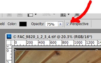
First Things First. I shot with a 12mm lens at an angle, so stuff is distorted. If you straighten the image to make the edge of the medicine cabinet on the left vertical, then the wall on the right is way off. That’s what you use “Perspective cropping” for.

Select the crop tool, clear any presets, then drag to select most of the image. You’ll get a different menu bar at the top when you do, and you’re going to want to select the “Perspective” tickbox as shown.


Now drag the bottom corners of your selection until the edges align with the features you want to be vertical. You may have to play with this a bit. If it doesn’t come out the way you expected, just step back in the history and try again. Photoshop will now create a rectangular image from your selection. If you used to use a view camera with a tilt lens, this is a similar effect. Click in the image to confirm. Magic!


Note that I could have levelled the image here too, but I like the way Lightroom does that, so I saved it for later. OK, what else? There was quite a bit of colour variation across the image. So I used hue/saturation adjustment layers with appropriate masking to vary the colours.I didn’t want the toilet paper roll in the lower right corner, so I used content aware fill to get rid of it. It didn’t work right away, so I had to take it, and the right wall, to a new layer and work there without distraction from other things in the image.

Since I’m really a fan of Topaz Adjust, I opened a duplicate layer with it and used just a little bit of adjustment – in this case I chose the “simplify” preset as a starting point, to smooth the image more. I added a little extra saturation and noise reduction too. Back in Photoshop, I copied the colourful towel to a fresh layer and boosted the saturation. The lights above the medicine cabinet were completely blown out. I copied them to a fresh layer and used the burn and dodge tools to give them a better look with a hot spot in the middle where the bulbs themselves are. There was still too much green in the image so I did a levels adjustment on the green colour channel.


Back to Lightroom. A little tweaking, crop to 8x10 proportion and we’re done. Here’s the final image:


The total time taken to process this image was about 30 minutes. It took me a lot longer to do it again with screen captures, etc so that I could write this up! One thing that amazes me is the lack of apparent noise, given that the camera was set for ISO 3200! And by the way, this was a small room: the width you’re looking at is only 6 feet and the camera was less than 8 feet from the door in the picture. Love that wide angle lens!

– 30 –

Thursday, March 3, 2011

Photoshop CS5 Content-aware Fill Trick

Today we’re going to talk about the Content-Aware Fill tool in Photoshop CS5. It’s an amazing tool but sometimes it seems to have a mind of its own! I want to introduce you to a trick I found to make it more predictable.

Content Aware Fill (CAF from now on so I don’t have to keep typing it) and the content-aware healing brush have dramatically streamlined the workflow, especially when trying to remove things like power lines or other objects. You can use the venerable clone stamp tool, but it’s more work, leaves behind lots of artifacts you have to clean up, and if you’re not careful, creates repeating patterns that are annoying and distracting in the image.

But sometimes, CAF produces unpredictable results. That can be good or bad: here’s a little ad image I created without intending to, when all I was trying to do was to isolate a couple of First Aid kits on a background. CAF picked up some unexpected content when I tried to use it. A very neat unanticipated effect!


Original photo


After CAF


How I used it on the website. Some extra effects from Topaz Adjust 4

 Generally, though, you’re trying to remove something from an image and replace it with what looks like the original background. If you’ve never used the Content Aware fill and healing brush functions, here’s a simple example. If you have, you can skip a few paragraphs.

Suppose I want to remove the sign from this picture.


The original photo

Draw a loose selection around the sign. You can use any selection tool – I usually just use the lasso but in this case I used the quick selection tool then expanded the selection by 50px or so. If the selection is tight then you’re going to see seams and edges around the area after you fill it. Be generous – give it space to breathe! Then hit Shift-F5 to invoke the Fill dialog and select content-aware from the drop down menu. It’s sticky: it’ll still be selected next time you try to use it.

In this screen capture, I painted the edges of the selection so you could see it.


Make a selection then initiate the "Fill" operation

The sign is magically gone. But the post is still there (I could have removed that in the same step but then I wouldn’t get to illustrate the CAHB -- Content-Aware Healing Brush). The background fill isn’t perfect but this is just a quick example. Paint over the post with the CAHB using a brush that’s about 50% bigger than the post (again, it needs room to breathe) and like magic, the post is gone, replaced with what Photoshop figures is what you wanted to be there.


Now use the content-aware healing brush

Here’s the finished product.


The finished image

What the CAF tool does is to look around the layer and using some very sophisticated algorithms, calculate what should replace the area you’re filling. I’ve just dropped a major hint about what the trick is. So if you’ve already figured out what I’m going to say, great! If not, follow me here.

OK, here’s another image I want to remove something from. The table at lower right shouldn’t be there.


So I make a loose selection around the table, hit shift-F5 <enter> and it’s gone! It even added in the wall duct, almost right down to the corner. But not totally seamlessly – it left some traces behind so I need to go in and fix it a bit.


Easy enough, right? Just make another selection around the area you want to clean up and do it again. Uh oh. Look what I got!


It picked up the leg from elsewhere in the image. Not what I wanted! I want it to pick up plain blank wall.

So let’s limit what CAF has available to it to choose from when doing the fill. Select only acceptable areas and copy them to a new layer (make the selections, then hit ctrl-J or cmd-J on a mac). In this case, you’ll have a layer that has only blank wall. Be sure to include the area you want to replace.


Working on that new layer, make a loose selection around the area you want to fix up and do your shift-F5 thing again. Sometimes it takes a few passes to completely clean up the image, but it’s relatively painless and quick. The last step is to merge the new layer with the original one. All done!


This is a lot less work and leaves a much cleaner blend than any of the other methods I’ve tried. OK well maybe not in this example, because I was trying to use one that was really obvious so you could see what’s going on. And I did it in a more complex than necessary sequence so I could show you how to do it and get the screen captures as I went along.

You could make your workflow even faster by creating a new layer first, either by selecting only the areas you want CAF to work from and hitting ctrl-J (Cmd-J) or by duplicating the whole layer then erasing all the stuff you didn’t want. Remember to leave enough behind for CAF to work from, outside the area you’re filling.

Any thoughts? The comment field is awaiting your input!

-- 30 –